
Scope
UI redesign for an existing app, focused on clarity, consistency, and a smoother path through core learning journeys.
- UI/UX audit
- Journey mapping
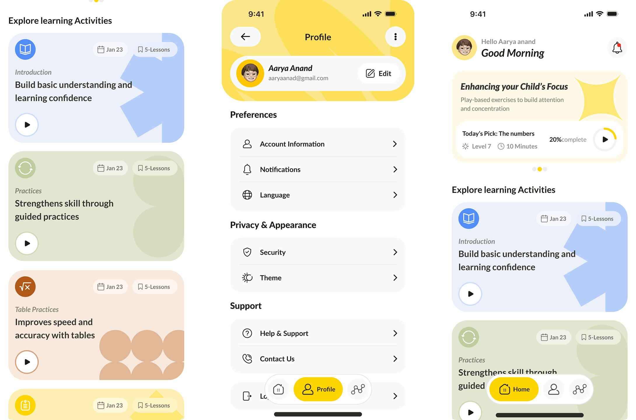
- Navigation and hierarchy
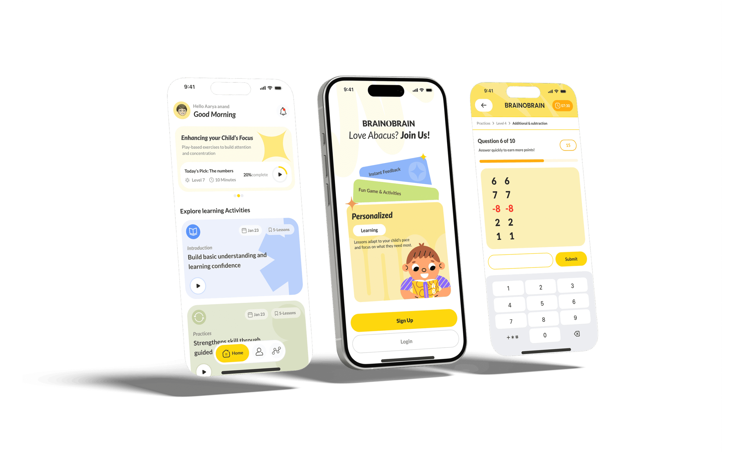
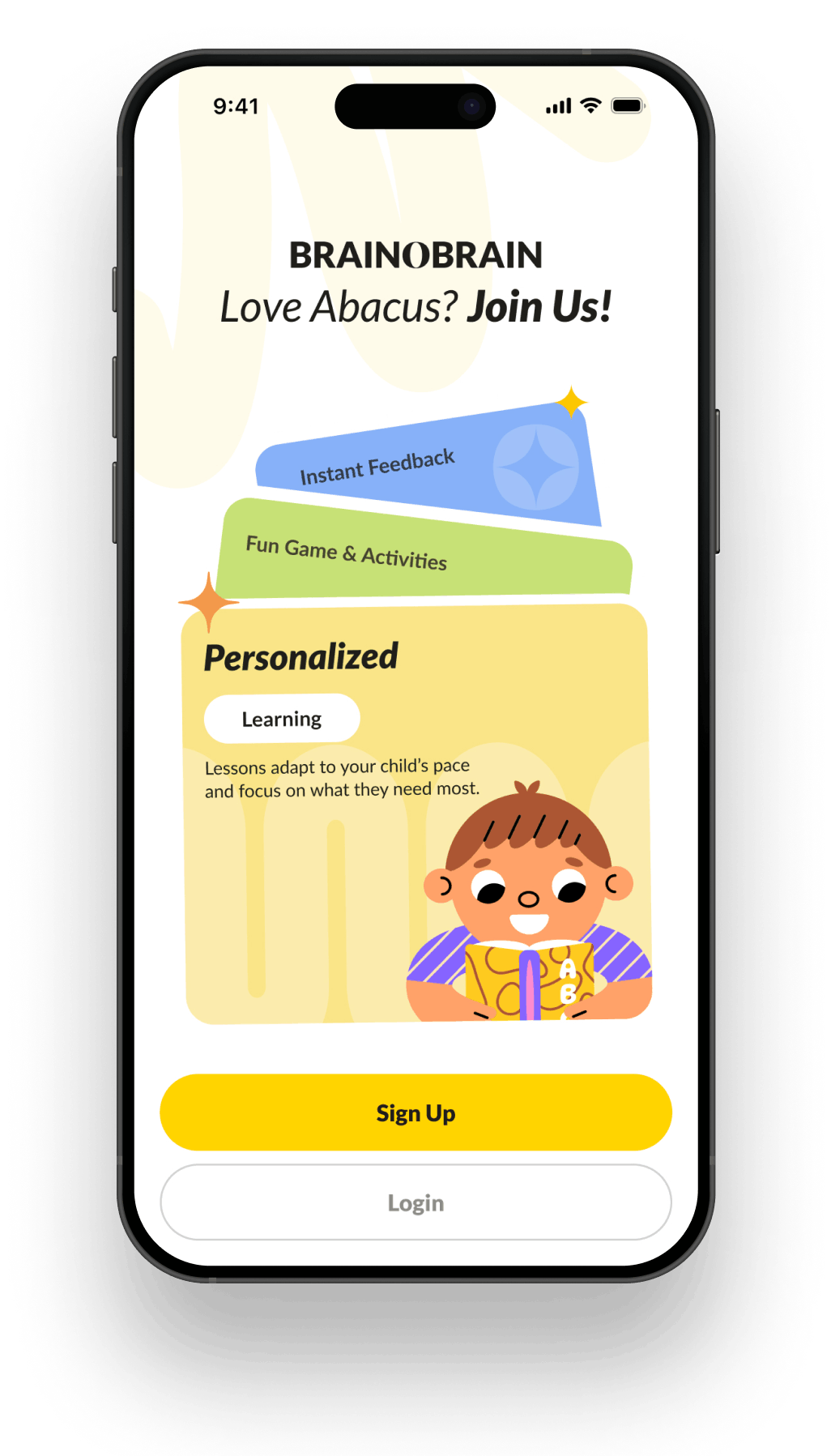
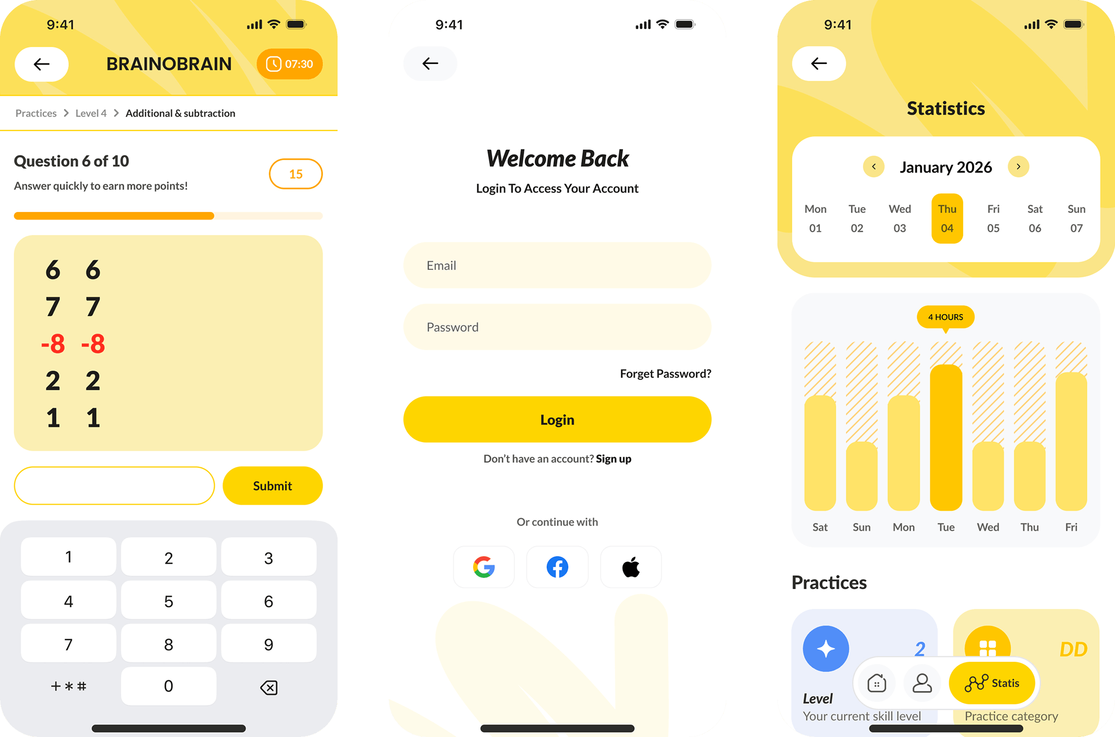
- Chat UI redesign
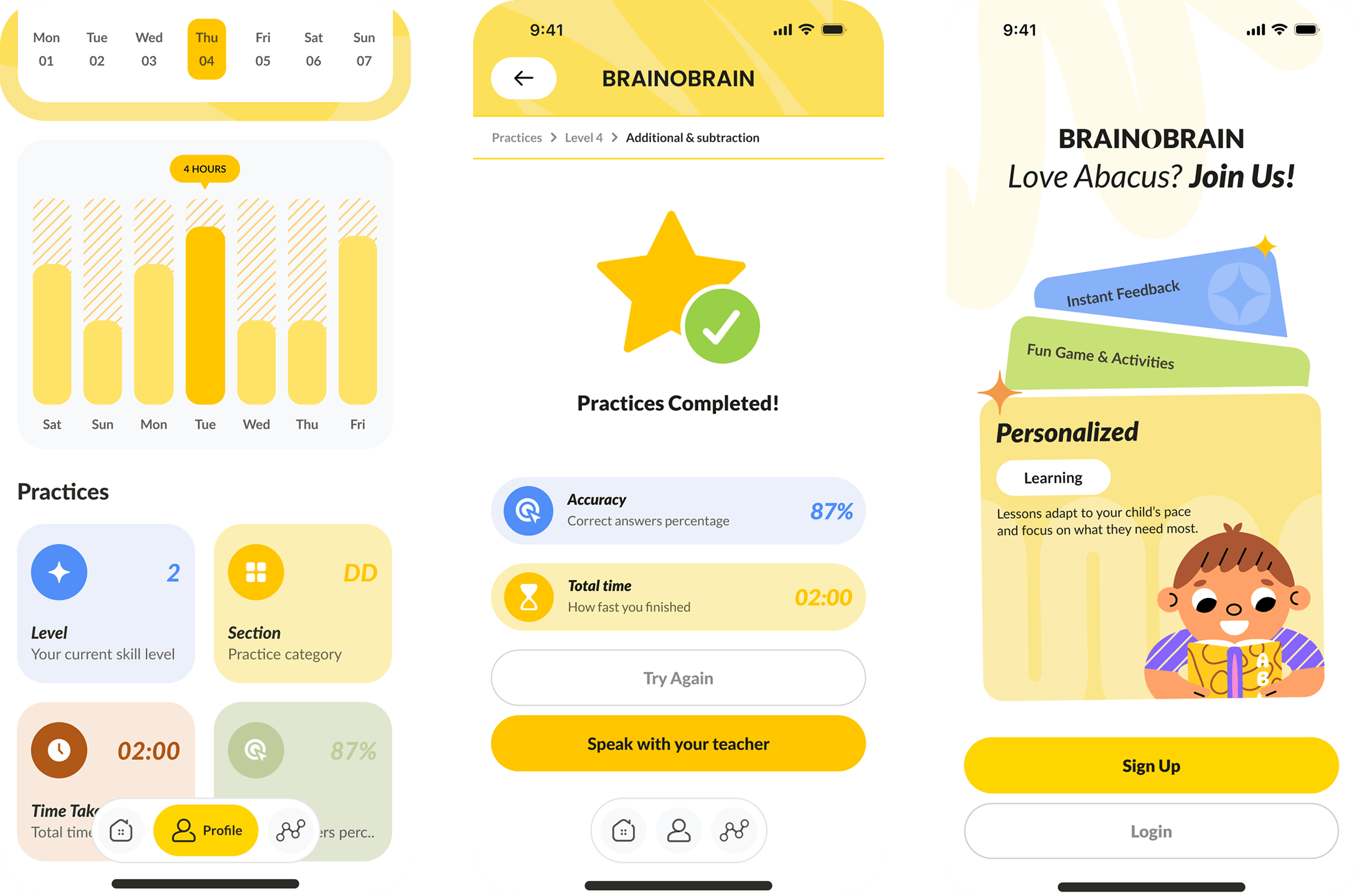
- Gamification improvements
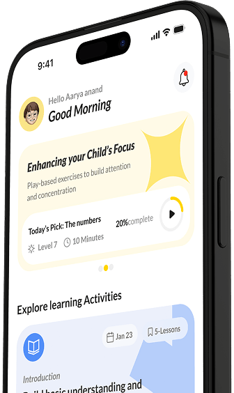
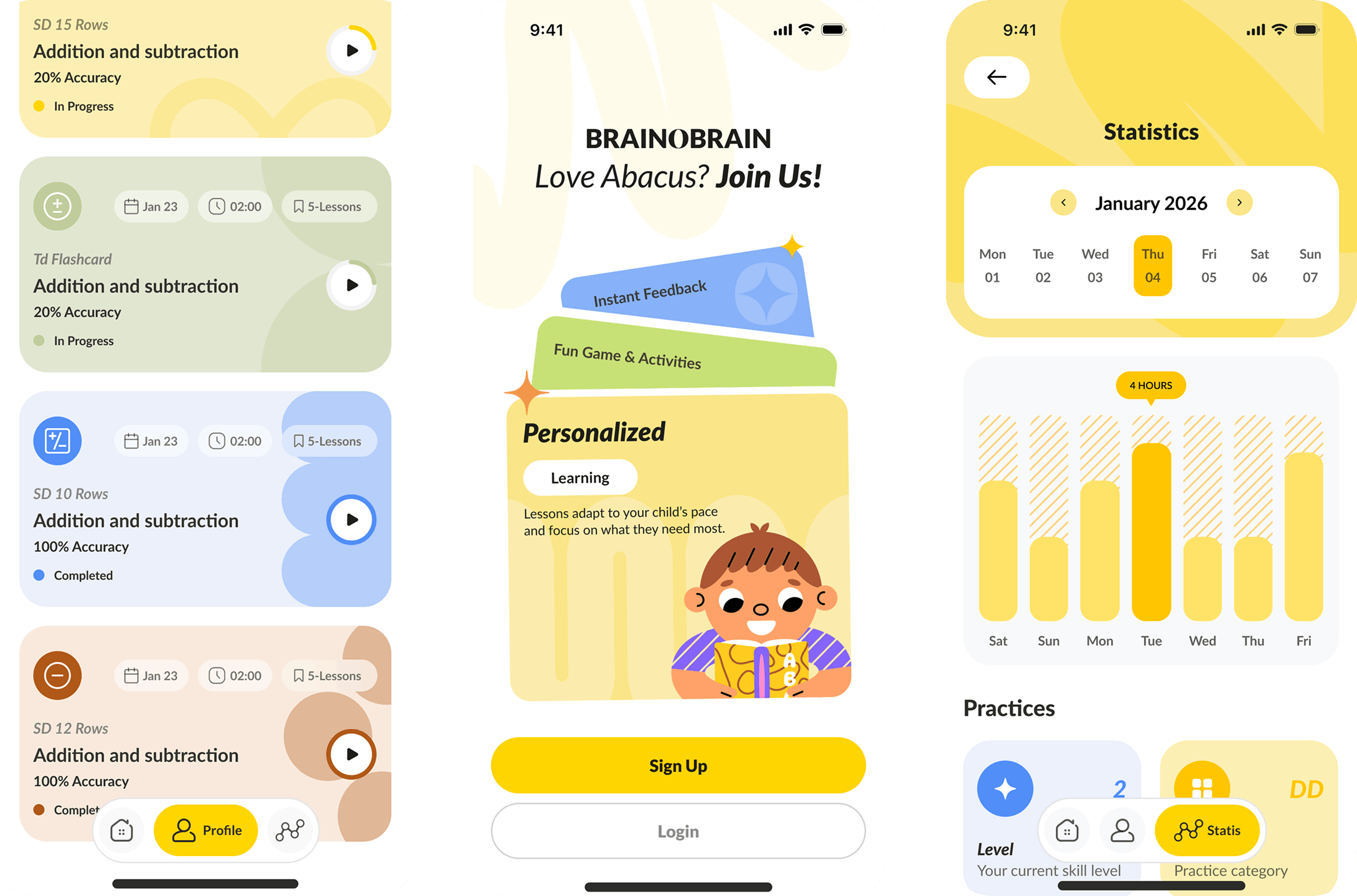
- Progress screens
- Component library
- Dev handoff notes

Resources
Lean senior team delivering a scalable UI system with build-ready documentation.
- 1 x Product/UX lead
- 1 x UI designer
- 1 x UX designer
- 1 x Delivery lead
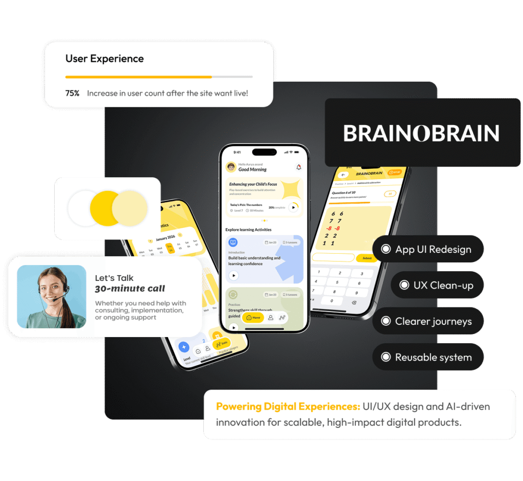
The Results
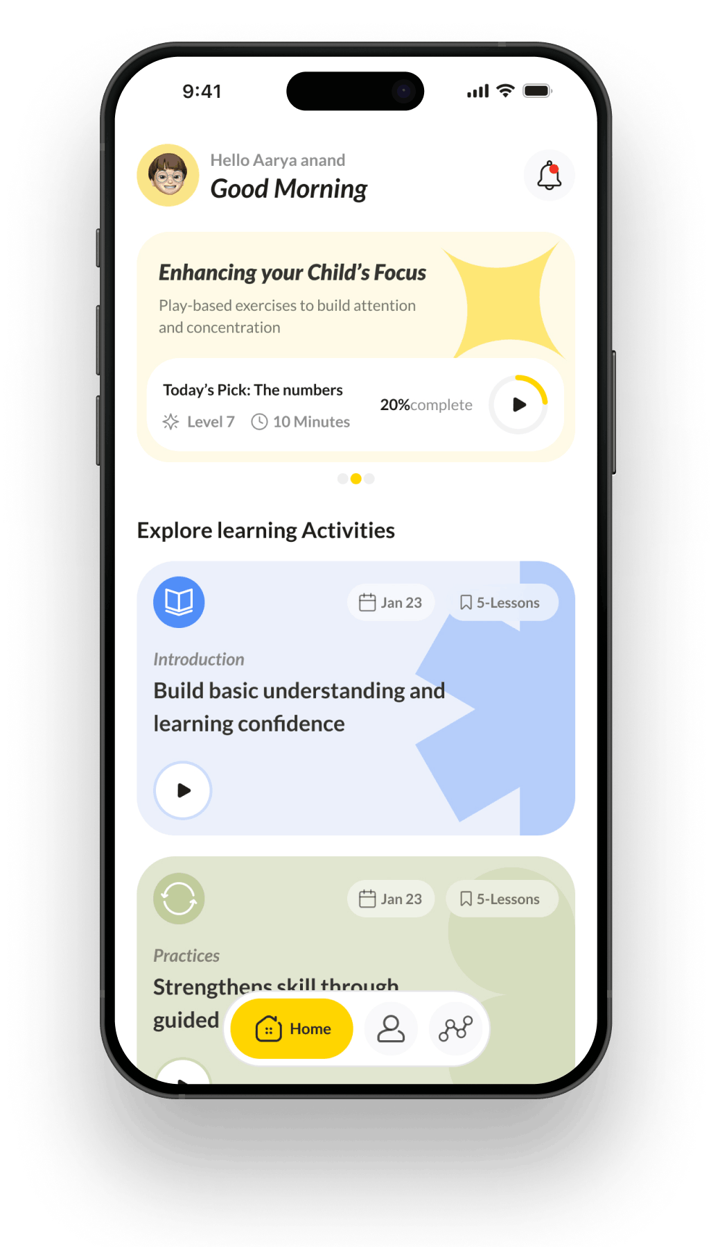
BrainObrain now has a cleaner, more consistent interface that reduces confusion across key learning flows. The redesign improved readability, strengthened visual trust, and delivered a UI kit that makes future iterations faster and lower risk.
Cleaner UI
Less friction
Clearer journeys
Better guidance
Reusable system
Faster rollout