


Scope
UI/UX design and handoff focused on a clearer proposition, stronger trust cues, and a smoother path to enquiry.
- UX research inputs
- Information architecture
- Conversion journey mapping
- Wireframes and hierarchy
- Brand identity direction
- UI components and layout rules
- Responsive designs
- Dev handoff notes

Resources
Small senior team focused on clarity, consistency, and build-ready outputs.
- 1 x Product/UX lead
- 1 x UI designer
- 1 x Brand designer
- 1 x Delivery lead
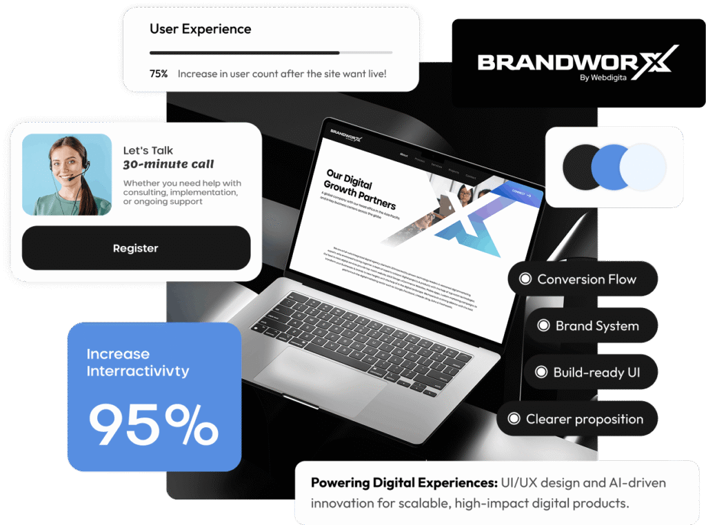
The Results
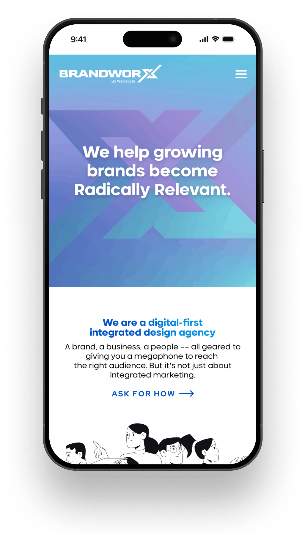
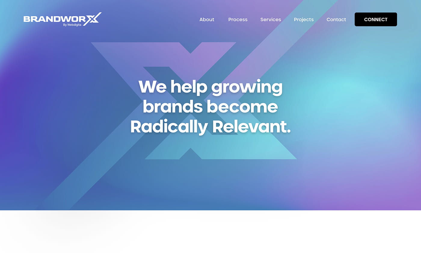
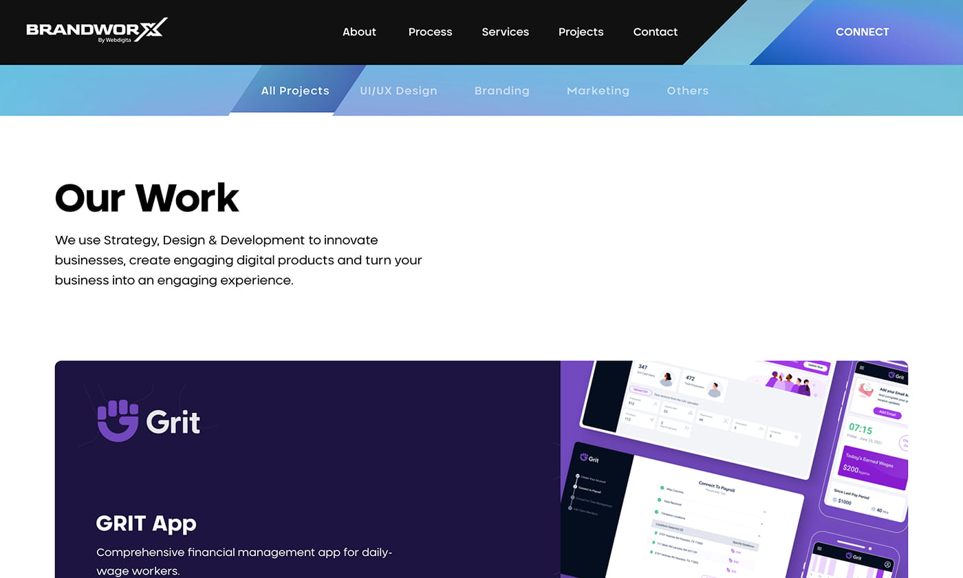
BrandworX now has a clearer story and a more consistent browse-to-enquiry journey. The UI system improves readability across devices and the handoff pack reduces implementation ambiguity for development.
Clearer proposition
Faster understanding
Stronger trust cues
Better proof flow
Build-ready UI
Cleaner handoff