Key Takeaways
- Web design is not the decorative layer applied after everything else is decided. It shapes how people understand your offer, how confidently they move through the site, and whether key actions feel obvious or effortful.
- Structure, visual hierarchy, navigation, responsive presentation, page layout, and trust signals all sit inside design scope - even when the problem first presents as weak copy or poor conversion.
- The more your business grows, the less forgiving weak design becomes. A site can function technically while quietly creating hesitation, inconsistency, and internal confusion about what actually needs fixing.
- Before asking for quotes, separate the real issue: is it design, content, UX, or platform fit? That distinction alone helps you avoid paying for a full rebuild when a focused rethink, audit, or clearer ownership would solve the problem faster.
Most businesses start web design too late, too early, or for the wrong reason. When results disappoint, the blame usually falls on the copy, the traffic, or the developer – when the real issue is often design scope: the structure is awkward, the visual hierarchy is weak, and the path to action asks too much of the visitor.
The short answer: Web design is the discipline of making a website easy to understand, easy to trust, and easy to use. It covers page structure, visual hierarchy, user journeys, responsive design, landing pages, and conversion design – not just colours and fonts. It starts to matter the moment your site stops reflecting your business’s actual capability, typically before conversion drops become obvious.
So if you are asking what web design actually is, you are probably not asking the theory behind it. You are trying to work out whether you have a visual problem, a UX problem, or the early signs of a bigger website decision. That matters because getting the scope wrong – buying too soon, too late, or for the wrong reason – wastes time quickly, especially once content, platform choices enters the picture.
This guide is for founders, marketing leads, ecommerce managers, commercial leads, and operations teams who need clarity before scoping a redesign, reviewing a brief, or deciding whether the issue is design, UX, content, or platform fit. And also for people who are searching for the best web design agency in london that will suit their requirements.
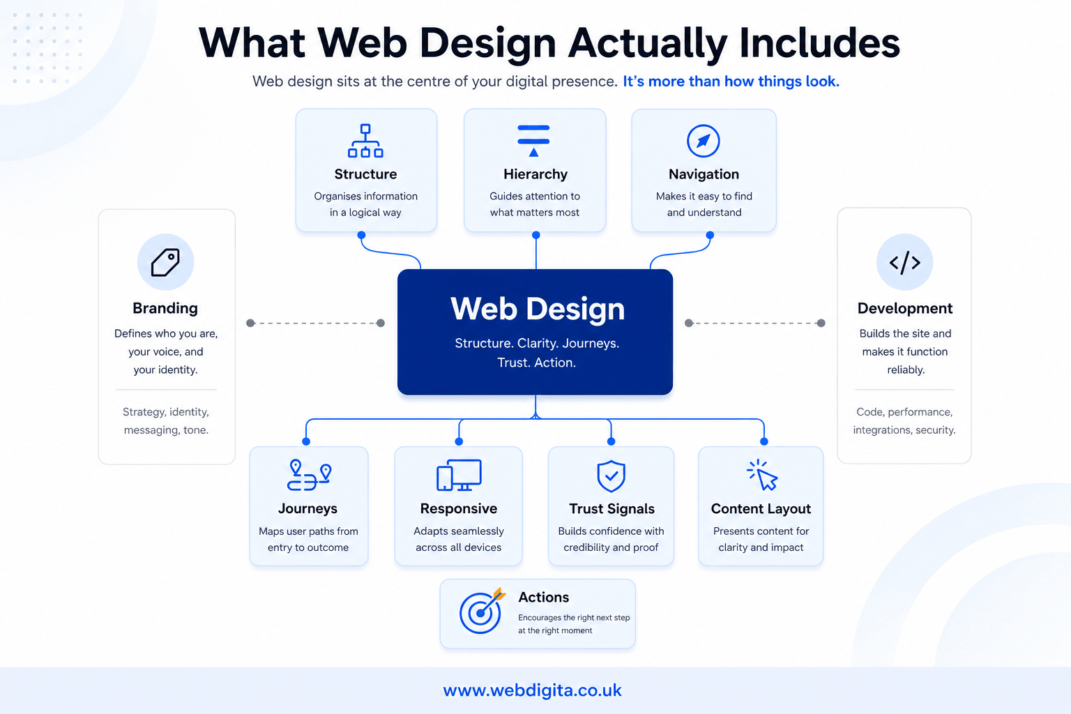
What web design actually is and what it includes
Web design is a professional discipline, not a single deliverable. It is the structured process of deciding how a website should be organised, how information should be presented, and how users should be guided from arrival to action. The output might be a set of pages, a design system, a landing page, or a full site architecture – but the work behind those outputs is analytical and strategic, not just aesthetic.
Most businesses underestimate its scope because what they see when a site is finished is the surface: colours, fonts, imagery, and layout. What they do not see is the thinking that determined why each element is where it is, why the navigation works the way it does, and why certain information appears prominently while other information is deprioritised. That decision-making is the discipline itself.
If you are trying to define scope for a project or review a brief, web design typically covers the following:
- Information architecture: how content is organised, categorised, and labelled so users can find what they need without friction or guesswork
- Page structure and layout: how each page is arranged so the most important information gets seen first and the next action is clear
- Visual hierarchy: how size, weight, colour, contrast, and spacing signal what matters most and guide the eye across a page
- User journeys: how visitors move through the site from entry point to outcome, including how different entry points lead to different paths
- Responsive design: how the site adapts across devices, screen sizes, and orientations without losing clarity or usability
- Landing pages: how dedicated pages are structured to support specific campaigns, offers, or traffic sources
- Conversion design: how page elements are arranged to reduce hesitation and make the desired action the easiest option
- Design systems: how visual and interaction patterns are standardised across the site so it behaves consistently and can be extended without rebuilding from scratch each time
- Trust signals: how social proof, credentials, offer clarity, and visual professionalism are used to reduce risk perception at key decision points
- Wireframes and prototypes: how layout and flow are tested and agreed before development begins, reducing expensive late changes
The right scope for any project depends on where the problems are and what the business needs to achieve. Not every project needs all of these. But understanding what web design actually covers helps you ask sharper questions when briefing an agency, reviewing a proposal, or deciding where to start.
What it sits next to, but is not
Three disciplines often get conflated in early project conversations, and confusing them creates scope drift and wasted budget.
Branding defines identity: your visual language, tone of voice, values, and the emotional impression your business makes. It informs design but does not do the same job. A strong brand with poor web design still produces a confusing, underperforming website.
Development builds the working site: the code, the platform, the database, the integrations, and the technical infrastructure. Development executes what design specifies. Asking developers to make layout and UX decisions without design input is one of the most common sources of avoidable problems in website projects.
Copywriting creates the words. Design determines how those words are presented – in what order, at what visual weight, and in what context. Copy and design need to work together from the start, not sequentially.
Web design sits at the intersection of all three. It translates business goals, brand identity, and content into structured, usable pages. It is where strategy becomes something a visitor can actually experience.
A common example is a site that looks respectable at first glance but still feels tiring to use. The pages are dense, visual hierarchy is absent, the next step is unclear, and mobile layouts bury the important bits. That is a design problem, even if nothing is technically broken – and no amount of better copy or faster hosting will fix it.
The core components of web design – and what each one does for your business
Understanding the individual components helps you diagnose which one is actually causing a problem. Most website issues trace back to one or two specific areas, not the entire site. Here is what each component does in practice and what it looks like when it is failing.
Visual hierarchy
Visual hierarchy is the system of signals that tells a visitor what to read first, what to pay attention to, and what to do next. It is built through size, weight, colour contrast, white space, and position on the page.
When visual hierarchy is working, a visitor landing on any page can answer three questions within a few seconds: where am I, what can I do here, and what should I do next. When it is absent, everything on the page competes equally for attention and nothing wins. The result is hesitation, higher bounce rates, and a site that feels exhausting even if the content is good.
For founders and commercial leads, weak visual hierarchy is often the invisible reason why a perfectly worded value proposition fails to land. The words are right but the page does not reinforce them.
UX and user journeys
User experience (UX) in web design refers to the quality of the interaction a visitor has with your site – how easy, logical, and satisfying it is to move from one point to another. User journeys are the specific paths visitors take from arrival to outcome.
Good UX design maps those journeys intentionally. It accounts for how different audiences arrive – organic search, direct, referral, campaign – what they are trying to do, and what friction points they are likely to encounter. Poor UX is often the result of designing for one imagined user type while ignoring the others.
For ecommerce managers and marketing leads, UX problems tend to show up as unexplained drop-off at specific points in the funnel – a product page that loses people before the add-to-cart, or a checkout that loses people between basket and payment. These are not always technical problems. They are often UX problems that need design intervention, not a platform change.
Responsive design
Responsive design is the practice of building a site that adjusts intelligently to different screen sizes – mobile, tablet, and desktop – without degrading in clarity or usability.
More than half of most business websites’ traffic arrives on mobile, yet many sites are still designed primarily for desktop and adapted for mobile as an afterthought. The result is compressed layouts, hard-to-tap buttons, text that requires zooming, and navigation that breaks on smaller screens. These are not minor aesthetic issues. They affect how users perceive the business and whether they complete the actions you need them to complete.
Responsive design is not just a technical implementation. It requires intentional design decisions: what gets prioritised on a smaller screen, how navigation changes, which elements stack and in what order, and how forms are simplified for touch input. A developer can implement responsiveness, but a designer needs to specify what that responsiveness should actually look like.
Landing pages
A landing page is a focused page designed for a specific audience, campaign, or traffic source. Unlike a homepage, which must serve multiple audiences and purposes, a landing page has one job: to move a specific visitor towards one specific action.
Landing pages matter for paid campaigns, SEO targeting, product launches, and service-specific enquiries. A well-designed landing page removes distraction, reinforces the specific message that brought the visitor there, and makes the conversion action as easy as possible.
The common mistake is sending paid traffic to a homepage or a generic service page. The homepage was not built for that visitor or that intent. The result is paid traffic that bounces because the landing experience does not match what the ad or search result promised – and a budget that disappears without producing the returns it should.
Conversion design
Conversion design is the practice of structuring pages specifically to reduce hesitation and make the desired action the easiest, most obvious next step. It draws on visual hierarchy, UX principles, and psychological signals – social proof, clarity of offer, risk reduction, specificity of outcome – to move visitors from interest to action.
This is not aggressive or manipulative design. Effective conversion design simply removes the friction that gets in the way of what the visitor was already considering doing. A clear headline, a specific call to action, a relevant trust signal, and a form that asks only for what is necessary – these are not tricks. They are the basic conditions for a page to do its commercial job.
For commercial leads and operations teams, conversion design is often where the most recoverable value sits. Traffic is expensive. A site that converts better from existing traffic is usually faster and cheaper to improve than one that needs more traffic to hit the same revenue numbers.
Design systems
A design system is a set of agreed, reusable components – buttons, forms, typography scales, spacing rules, colour usage – that gives a website consistent visual and interaction patterns across every page.
For growing businesses, design systems matter because they reduce cost and inconsistency over time. Without one, every new page, campaign, or update becomes a bespoke design exercise. Pages start to look and behave differently from each other. The site gradually loses coherence, and any future redesign becomes harder because there is no consistent foundation to build from.
For teams managing a WordPress site or a platform with multiple contributors, a design system is also an operational tool. It means non-designers can add pages or update content without inadvertently breaking the visual logic of the site.
Page speed as a design consideration
Page speed is increasingly a design responsibility, not just a technical one. Heavy image files, unoptimised layouts, excessive design complexity, and render-blocking scripts are often the direct result of design decisions made without performance constraints in mind.
Google’s Core Web Vitals – which measure loading speed, interactivity, and visual stability – directly influence search rankings and are influenced by design choices. A beautifully crafted page that loads slowly on mobile is doing measurable commercial damage that is invisible in the design tool but highly visible in analytics and rankings.
Good web design accounts for performance from the start, not as a remediation step after build.
A simple framework: what it is, what it is not, when it matters, who owns it
If your team is mixing up design, development, and content, use this as a quick internal sorting tool before anyone starts asking for quotes.
WEBDIGITA Web Design Scope Matrix: use this to separate web design from adjacent work, spot when it has become commercially important, and clarify who needs to be involved before scope drifts.
| What web design is | What it is not | When it starts to matter | Who usually owns or influences it |
|---|---|---|---|
| Site structure, page layout, visual hierarchy, user journeys, trust signals, responsive design, conversion design | Just branding, just copywriting, or just front-end code | When users hesitate, pages feel inconsistent, or growth creates more complexity | Marketing, brand, leadership, UX, and development |
| Wireframes, UI patterns, landing pages, design systems, conversion-focused page decisions | A full rebuild by default | When traffic grows and weak journeys start affecting leads, sales, or confidence | Marketing or product often leads, with input from operations and commercial teams |
| Presentation that helps users understand what you do and what to do next | A cosmetic layer added at the end | When the site no longer reflects capability or creates internal friction | Leadership should stay involved where positioning, offers, or trust are at stake |
You should use a framework like this early – not after proposals arrive. If your team cannot explain whether the issue is structure, content, UX, or platform, I would push for clarity first, often through a project discovery workshop or a similar scoping step.

Not sure if you have a design problem yet
We can help you separate layout, UX, content, and platform issues before you scope a redesign or ask for quotes.
A useful first step for early-stage teams.
When web design starts to matter for a growing business
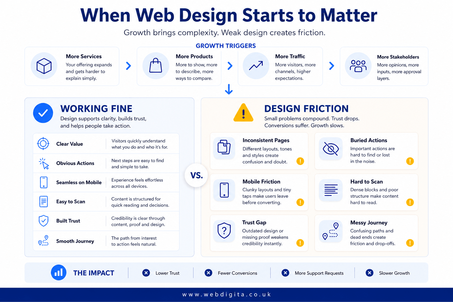
It usually matters earlier than teams expect. A small placeholder site can survive for a while, but once the business adds more services, more products, more traffic, or more decision-makers, weak design stops being a surface issue and starts affecting performance.
The transition point varies, but the underlying pattern is consistent. At some stage, the site stops being a business card and starts being asked to do real commercial work – generate leads, build confidence with new audiences, support sales conversations, or handle enquiries at scale. At that point, the design decisions made when the site was simpler start to create friction that compounds.
The warning signs to watch for
You are likely seeing this when the site no longer matches the capability behind it. Page speed becomes a friction point. Sales conversations become more consultative because the website is not doing enough trust-building upfront. Internal teams start patching pages one by one, but the overall journey still feels disjointed.
- Key pages look and behave differently from each other
- Important actions are hard to find or feel buried
- Mobile presentation makes scanning or enquiry harder
- Content is technically present but difficult to absorb quickly
- The site feels more like a collection of pages than a joined-up journey
- New service or product additions feel bolted on rather than integrated
- The homepage tries to serve too many audiences and ends up serving none of them well
- Paid traffic converts at a fraction of what the audience quality should produce
Watch for those signs before conversion drops become obvious. If you want to understand what starts to change website costs once eCommerce requirements enter the picture, this is usually where design decisions start affecting wider scope, delivery risk, and budget.
The compounding cost of design debt
Design debt is what accumulates when small, pragmatic design decisions are made without a coherent system behind them. An extra page added here, a banner dropped in there, a new section added to accommodate a new service. Each individual decision seems reasonable. Over time, the result is a site with no visual logic, no consistent UX, and no clear hierarchy.
The cost of design debt is not just aesthetic. It increases the time and budget required for any future work because every change has to contend with accumulated inconsistency. It also makes onboarding new marketing or development resource harder, because there are no established rules to follow.
Addressing design debt early – through a design system, a focused UX review, or a structured redesign – is almost always cheaper than waiting until it has compounded into a full rebuild requirement.
How web design connects to revenue and business performance
This is the section most introductory web design articles skip, and it is the most important one for anyone making a commercial case internally or deciding how much to invest.
Web design is not a cost centre. When it is done well, it is the mechanism by which traffic becomes revenue. When it is done poorly, it is a tax on every other investment you make – paid media, SEO, content, sales resource, and operations.
The trust-conversion relationship
Visitors make trust decisions about a business within seconds of arriving on a website. Visual hierarchy, layout professionalism, clarity of offer, and the presence of the right trust signals all contribute to whether that first impression creates confidence or doubt.
For B2B businesses and higher-ticket purchases, this initial impression has a disproportionate effect. A prospective client who loses confidence in the website will often not enquire, even if the underlying business is exactly what they need. The site has failed to close the trust gap before the sales conversation ever begins.
Conversion design addresses this directly. It is not about making the site look more impressive. It is about making the value clear, the risk feel low, and the next step feel obvious – at the specific point in the journey where the visitor is making their decision.
Design as a sales tool
In businesses where sales conversations are significant – professional services, agency work, higher-value products, or considered ecommerce purchases – the website plays a role in the sales cycle whether or not it captures the lead directly.
Prospects research before they speak to anyone. They compare options, assess credibility, and form views about how sophisticated and reliable a business is based entirely on what they see. A site that looks inconsistent, feels unclear, or makes the offer hard to understand can undermine a sales conversation that never even happens.
Good web design shortens sales cycles by doing some of the trust and clarity work before human contact begins. For founders and commercial leads, that is a measurable commercial benefit, not just an aesthetic one.
The operational case for design
There is an operational dimension that founders and operations teams often miss entirely. A website with poor UX and unclear information architecture generates more inbound support queries, more clarification calls, and more friction in processes that should be self-service. Customers who cannot find what they need ask for it. Staff who try to send people to the website to answer a question find it fails them.
A well-designed site reduces this operational load. It anticipates common questions, structures information so it can be found without assistance, and makes processes like booking, enquiry, or purchase as self-sufficient as possible. For businesses at growth stage, that efficiency gain is significant.
Who owns web design decisions – and why it matters
Ownership of web design is genuinely ambiguous in most growing businesses, and that ambiguity is expensive. When no one clearly owns the design, decisions get made by whoever happens to be available – often the developer, the marketing executive who last touched the site, or the founder who is already stretched.
The result is inconsistency: pages that do not match each other, design choices made for convenience rather than strategy, and a site that reflects no coherent thinking about what it needs to achieve commercially.
Who tends to own what in practice
In most small and mid-sized businesses, design ownership breaks down something like this:
- Marketing leads tend to own traffic, conversion, and campaign landing pages – making them the primary stakeholders for conversion design and UX decisions on high-traffic pages
- Founders and commercial leads own positioning, offer clarity, and trust – making them essential voices for homepage, service pages, and any page where commercial credibility is at stake
- Operations teams own the internal friction dimension – making them important stakeholders for any page or process that affects staff time, customer support, or operational workflow
- Ecommerce managers own product journeys, conversion rates, and catalogue structure – the primary stakeholders for product page design, basket flow, and landing page performance
- Developers implement what design specifies – but should not be making primary layout or UX decisions without design input, even on smaller projects where design resource feels like an overhead
What happens when ownership is absent
When design ownership is unclear, three things tend to happen. The site accumulates pages with no shared logic. Commercial priorities are never translated into design priorities – so the most important conversion actions are not the most prominent elements. And any attempt to improve the site becomes contentious because there is no agreed framework for making decisions.
The solution is not necessarily a dedicated in-house designer, especially for smaller businesses. It is a clear brief, an agreed hierarchy of decision-makers, and – ideally – an agency relationship where strategic design decisions are made alongside someone who understands the commercial context, not just the craft.
Common misconceptions that cost teams time and money
The most expensive mistake is treating web design as decoration. The second is treating every website problem as a reason for a full rebuild. In my experience reviewing project briefs across builds, audits, migrations, and growth engagements, both mistakes happen regularly – and both are avoidable with better scoping upfront.
The pattern I see most often: a business arrives asking for a redesign when the actual problem is unclear ownership, weak page priorities, or assumptions that were never challenged early enough. The design budget gets spent hard-coding a confusion problem rather than solving it.
| Misconception | Reality |
|---|---|
| Design only means visuals. | Design also shapes structure, visual hierarchy, and user flow — the things that determine whether a visitor stays and acts. |
| If the site works technically, design is fine. | A technically working site can still create hesitation and friction at every trust signal and conversion point. |
| Every problem needs a redesign. | Sometimes a focused UX audit, a conversion design pass on key landing pages, or a single page rethink is enough. |
| Design comes after strategy and content are finished. | Good design thinking helps shape both — often exposing gaps in the brief before build begins and budget is committed. |
| Design systems are only for large businesses. | Any site with more than a handful of pages benefits from consistent visual and interaction rules, and establishing them early is significantly cheaper than retrofitting them later. |
My view, having reviewed briefs across a wide range of project types, is that the trade-off is simple: rush into build mode and you risk paying to hard-code confusion. The safer move is clarity first – naming what is actually failing, whether that is trust, UX, visual hierarchy, conversion design, or platform fit – before any scope is agreed.
If the likely route is a WordPress site, make sure the design thinking and build plan stay connected from the start, especially if you are shortlisting options for a London based WordPress development agency.
First steps before you scope or buy anything
If you have read this far and are now trying to work out what to do next, the answer is almost always the same: name the problem before you define the solution.
Most website projects go wrong because the brief is written around a solution – “we need a redesign” – rather than a problem – “our homepage does not convert enquiries from paid traffic because it does not clearly explain our offer to a cold audience.” The first statement leads to a broad, expensive project. The second leads to a focused, answerable scope.
Questions to ask before briefing anyone
These questions are designed to separate a clear brief from a vague one. If you cannot answer most of them, you are not ready to brief an agency and you will receive wide-ranging proposals that do not target the real problem.
- Which specific pages or journeys are underperforming – and what does underperforming mean in measurable terms?
- Who are the primary audiences arriving at those pages, and what are they trying to do when they get there?
- What action do you want those visitors to take, and is that action currently clear, easy to find, and low-friction?
- Is the issue with trust, clarity, navigation, conversion design, or something on the platform or technical side?
- Has the current site been analytically reviewed, or are you working from instinct and internal opinion?
- What is the commercial priority – more leads, better quality leads, higher conversion from existing traffic, or operational efficiency?
- Does the fix need design, development, content, or all three – and have you separated those in your thinking before opening conversations with agencies?
When discovery is the right next step
If you cannot confidently answer most of those questions, a structured discovery process is almost always the right investment before anything else. Discovery involves mapping what the site is currently doing, identifying the gaps between that and what the business needs, and producing a prioritised scope based on evidence rather than assumption.
It is a smaller commitment upfront and it almost always produces a sharper brief. It also reduces the risk of an expensive build that solves the wrong problem. For teams at this stage, our project discovery workshop is built precisely for this decision point.
The next move is usually clarity, not speed. Once your team can name the real problem, buying the right level of design – at the right time, for the right reason – becomes straightforward.
Common questions about web design before you scope a project
These answers help teams separate design from adjacent work so they can brief the right problem, not just the loudest one.
1. What is web design in plain English?
Web design is the work of making a website easy to understand, easy to trust, and easy to use. That includes page structure, layout, hierarchy, navigation, responsive presentation, and the way users move towards an action. It is broader than visual styling alone because it affects how clearly the business is presented and how easily visitors can make sense of what to do next.
2. Is web design the same as UX design or web development?
No, web design is not the same as UX design or web development. Web design sits between brand thinking and build delivery, turning business goals into usable pages and journeys. UX overlaps where user flow and clarity matter, while development is the technical job of building the site. Treating them as interchangeable usually creates blurred ownership and weaker decisions.
3. How do I know if my website problem is actually a design problem?
A website problem is often a design problem when the site works technically but still creates hesitation. Common signs include unclear next steps, inconsistent page layouts, weak mobile scanning, buried actions, and pages that feel dense or tiring to use. If visitors can access the content but still struggle to understand, trust, or move forward, design is likely part of the issue.
4. Does every web design issue mean we need a full redesign?
No, not every web design issue needs a full redesign. Sometimes the better fix is a focused audit, a rethink of key pages, or a tighter conversion-led design pass. A full rebuild makes sense when the problems are structural and spread across the site, but smaller interventions can be enough when the issue is concentrated in hierarchy, layout, or page priorities.
5. When does web design start to matter more for a growing business?
Web design starts to matter more as the business adds complexity. More services, more products, more traffic, and more stakeholders make weak structure harder to hide. At that point, design affects trust, internal efficiency, and commercial performance because the website has to explain more, guide more clearly, and support better decisions from visitors who do not already know the business.
6. Who should be involved in web design decisions?
Web design decisions usually need input from more than one team. Marketing often leads, but leadership, brand, UX, operations, and development should all influence the work where positioning, trust, delivery constraints, or user journeys are involved. If one function owns the whole decision in isolation, the result often looks tidy on paper but fails commercially or operationally.
Conclusion
If your team is asking what web design is, the real question is usually what kind of website problem you actually have. Getting that diagnosis right matters more than rushing into a redesign, because once design decisions are baked into content plans, build scope, or platform choices, confusion becomes expensive.
- Scope: Treat web design as the logic of pages and journeys, not just the visual finish.
- Ownership: Keep leadership, marketing, and delivery teams aligned where trust, positioning, and user flow affect commercial results.
- Risk: Do not assume every weak website outcome needs a full rebuild or that a developer should solve design gaps by default.
- Next step: If the issue is still hard to name, pause and clarify the failure point first, because the right buy usually starts with a better question.
If design is affecting clarity, trust, or conversion, start here
Our web design service helps teams turn messy structure, weak hierarchy, and inconsistent journeys into clearer pages that support enquiries, sales, and day-to-day growth.
Explore web design servicesStill weighing up the issue