Key Takeaways
A proper UX friction audit for lead-gen websites should test the enquiry path, not just the look and feel. The useful checks are practical: whether the main CTA is clear, whether trust appears before the ask, whether forms feel proportionate, and whether mobile users can complete the same journey without strain. If one stage is weak but the rest of the path holds up, that usually points to a fixable conversion leak rather than a rebuild case.
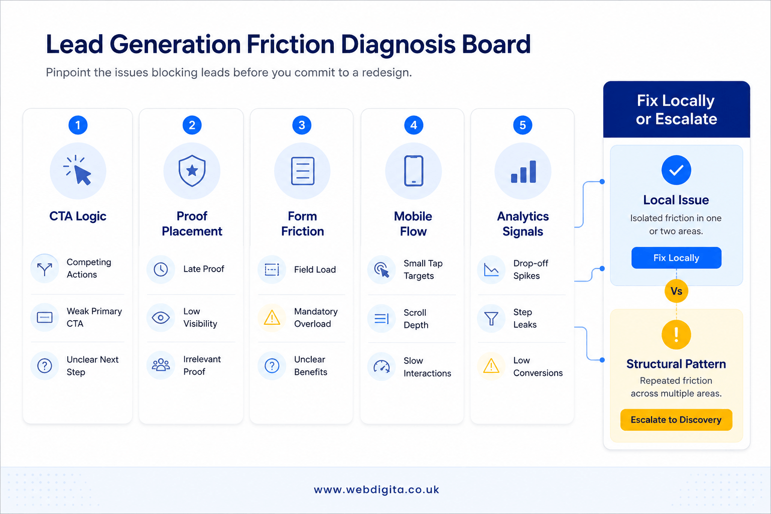
The more important judgement is whether the problem is local or structural. If low CTA clicks, form drop-off or mobile abandonment can be traced to specific pages or interactions, targeted optimisation is often the smarter move. If the same confusion repeats across messaging, hierarchy, trust flow and page purpose, redesign discussions should pause until discovery clarifies what the site is actually meant to do.
Many lead-gen sites carry obvious conversion friction long before they need a full redesign. The budget gets pointed at a rebuild anyway, because a new interface feels like progress. That is where the money gets wasted.
A lead-gen UX friction audit should review CTA hierarchy, message clarity, proof placement, form experience and mobile completion – in that order. These are the conversion-path elements most likely to be blocking leads right now. If friction is isolated and measurable, targeted fixes typically outperform a redesign. If the same breakdown repeats across journey mapping, information architecture and page structure together, that is the signal to move into discovery before a brief is approved.
A focused UX friction audit separates local conversion leaks from deeper structural issues. If you want to avoid wasted budget, review where intent is being lost before you approve new wireframes, new templates or a bigger build. In some cases, the right next step is targeted optimisation – In others, the based audit should push you to speak with a UI UX Strategy Consultant so scope, hierarchy and delivery risk are clear before redesign starts.
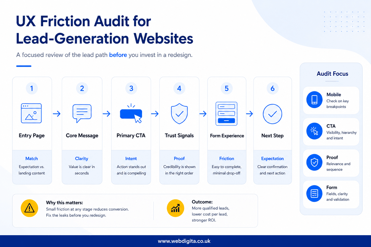
What a lead-gen UX friction audit should actually review
A lead-gen friction audit is not a full critique of brand, visuals or every usability edge case. It is narrower: review the journey that turns interest into enquiry. That means what the page promises, how the next step is framed, where trust appears, how the form behaves, and whether mobile users can move through the same flow without strain. This is conversion UX, not general usability testing.
Start with CTA hierarchy. Check whether the main action is obvious on key pages or buried under softer options – newsletter sign-up, resource download or vague contact prompts. If every page asks for something different, or asks too early, you are creating hesitation rather than momentum.
Then review message clarity and proof sequence. Ask whether a first-time visitor can quickly understand who you help, what problem you solve and what happens next. Check whether testimonials, accreditations, sector signals or delivery proof appear before the ask, not after it.
Do not treat forms and mobile as separate checks. They are part of the same lead path. A common pattern: a service page that looks polished on desktop forces mobile users to scroll past weak proof, hit a long form and submit without any reassurance about response time or next steps. That is a journey mapping failure, not a redesign verdict.
Lead-gen page-flow audit map with discovery handoff
Review the journey in this order: entry page, core message, primary CTA, nearby proof, form experience, then post-submit expectation. If one stage is weak but the rest holds, fix it locally. If the breakdown repeats across several stages and pages, treat it as a structural issue.
The friction points that usually block leads before a redesign is justified
Most underperforming lead-gen sites do not fail because the interface is old. They fail because the conversion path loses confidence at the wrong moments. Look for friction that is measurable, repeated and close to the lead action.
CTA logic breaks first. Watch for pages with too many competing actions, vague button language or CTAs placed before the user has enough context to act. In my experience reviewing lead-gen audits, the pattern that recurs most often is intent leaking through confused information architecture and weak conversion sequencing – not outdated design. If users are being asked to enquire before they understand the offer, the issue is flow, not aesthetics.
Proof placement matters more than most teams expect. Check whether trust signals sit near the decision point or are stranded lower down the page. If your strongest proof only appears after the form, I would treat that as a direct warning sign – not a visual preference issue.
Form friction is rarely just about field count. Check labels, error handling, privacy reassurance and what happens after submit. If the form asks for effort without explaining the payoff, people stall. Strong page engagement alongside weak form completion is one of the most reliable analytics signals available.
Mobile friction deserves hard scrutiny. Test sticky CTAs, tap targets, keyboard behaviour and scroll depth on actual devices. If mobile users reach the form less often, abandon faster or struggle with layout shifts, you likely have a fixable journey problem – not a redesign case.
WEBDIGITA Lead Path Decision Checklist: use this to decide whether you are looking at local friction or a broader experience problem that needs deeper work.
- If CTA clicks are low, check message clarity and CTA wording before blaming design style.
- If users reach the form but do not submit, inspect field load, reassurance and next-step clarity.
- If proof is strong but engagement is weak, review page hierarchy and whether the right proof appears near the right ask.
- If drop-off is heavier on mobile, test the full path on a phone before approving desktop-led redesign decisions.
- If the same confusion appears across service pages, landing pages and contact paths, stop patching page by page and assess information architecture first.
If you cannot point to where confidence breaks in the journey, you are not ready to prescribe a redesign.
If your site runs on WordPress, this matters even more because teams often confuse template frustration with journey failure. Before you brief a rebuild or hire for UX Design agency in london, be clear whether the real blocker sits in content hierarchy, proof sequencing or form UX.

Not sure if your site needs fixes or a full redesign
A quick UX friction audit can show where leads are stalling across CTA logic, proof, forms and mobile flow before you commit more budget.
Clear diagnosis before you brief a rebuild
When to optimise locally and when to move into discovery
This is where most BOFU buyers stall – not because the decision is genuinely hard, but because the audit findings have not been mapped to a clear threshold. Here is how to set one.
Optimise locally when:
- Friction is tied to specific pages or interactions and does not repeat across the site.
- The offer is clear, information architecture broadly works and the main issues are CTA wording, proof placement, form design or mobile completion.
- Usability testing or analytics point to one or two discrete, fixable breakdowns.
Move into discovery when:
- The same breakdown repeats across service pages, landing pages and contact paths.
- Service positioning is unclear and internal teams cannot agree on page purpose or audience priority.
- Journey mapping reveals that trust flow is inconsistent across the site, not just one section.
- Page-by-page fixes keep exposing bigger questions about conversion structure or hierarchy.
That threshold matters because redesigning before diagnosis creates rework, scope drift and slower delivery. If you are close to supplier selection, ask for an audit first and push for evidence rather than assumptions. If the findings point to architecture, ownership or delivery risk beyond UX alone, bringing in the support of a Lead Generation Agency can help you challenge marketing & technical assumptions before the requirement document is finalised.
If you want a clear next step, start with a free audit. That gives you a grounded view of whether targeted UX fixes will move the dial or a deeper discovery phase is the right investment.
Questions buyers ask before approving a lead-gen redesign
These are the practical checks that help you decide whether you need targeted UX fixes or a deeper discovery phase.
1. What is a UX friction audit for a lead-gen website?
A UX friction audit for a lead-gen website is a focused review of the journey from interest to enquiry. It looks at CTA hierarchy, message clarity, trust placement, form behaviour, mobile usability and post-submit expectations. The aim is to find where confidence drops before a lead is submitted, so you can tell whether the issue is local friction or a broader structural problem.
2. Can a UX friction audit show that a redesign is not needed?
Yes, a UX friction audit can show that a redesign is not needed. If the main problems sit in CTA wording, proof sequencing, form reassurance or mobile completion, targeted optimisation may solve the issue faster and with less waste. The audit helps separate fixable conversion leaks from deeper problems that genuinely justify redesign work.
3. What are the most common friction points on lead-gen websites?
The most common friction points are confused CTA logic, weak message clarity, poorly placed trust signals, hesitant form experiences and mobile-specific journey problems. These issues often reduce enquiries even when the site looks polished. The pattern to watch is where confidence breaks close to the lead action, not whether the interface feels visually dated.
4. When should a team move from UX fixes into discovery?
A team should move into discovery when the same issues repeat across multiple pages and stages of the journey. If service positioning is unclear, information architecture is muddled, trust flow is inconsistent and page-by-page fixes keep exposing bigger questions, discovery is the safer next step. That is usually a sign the problem sits in structure, not just execution.
5. Why is mobile testing so important in a lead-gen audit?
Mobile testing is important because many lead paths break differently on phones than on desktop. Sticky CTAs, tap targets, keyboard behaviour, layout shifts and scroll depth can all affect whether users reach and complete the form. If mobile users abandon earlier or struggle to progress, the site may have a journey problem that is fixable without a full redesign.
6. What should a team check before briefing WordPress development work?
A team should check whether the real blocker is technical or journey-related before briefing WordPress development work. If poor performance comes from content hierarchy, proof sequencing or form UX, rebuilding templates may not solve the problem. The smarter move is to diagnose where confidence drops first, then decide whether development is actually the right response.
Conclusion
Redesign decisions get expensive when teams confuse visible age with actual buying friction. A cleaner interface will not rescue a lead path that asks too much, proves too little or loses confidence at the wrong moment. The value of an audit is that it gives you a threshold for action instead of another round of assumptions.
Check first: if the offer is clear and the journey mostly works, tighten the weak points before you approve broader UX or development work.
Escalate when needed: if the same breakdown shows up across page hierarchy, trust flow, forms and messaging, move into discovery before the brief hardens, because that is where better scope decisions get made.
If friction runs deeper, start with a structured discovery workshop
When CTA issues, trust gaps, page hierarchy and form problems repeat across the site, discovery helps define scope, priorities and delivery risk before redesign work begins.
Explore discovery workshopNot ready for that yet