Key Takeaways
A useful WordPress UX audit is less about judging how polished the site looks and more about finding where confidence drops, journeys stall, and avoidable friction starts costing enquiries.
- Scope: Review the full path to enquiry, including navigation, content hierarchy, trust signals, forms, search, and the mobile journey rather than isolated pages.
- Hidden friction: WordPress issues often come from template drift, page-builder sprawl, plugin overlap, and inconsistent editing rather than obvious design failure.
- Priority: Fix the blockers that damage trust and lead flow first, such as vague navigation, weak proof placement, overlong forms, and cramped mobile experiences.
- Decision logic: Separate quick UX fixes from deeper structural problems before assuming a redesign is needed.
- Rebuild threshold: A rebuild makes sense when the same problems keep returning because the setup, governance, or template logic cannot hold consistency.
Rebuilding too early is one of the easiest ways to waste budget on a WordPress site that is still capable of performing. If leads have slowed, quality has dropped, or trust feels weaker than it should, the visible design is not always the real problem. More often, the friction sits in the structure – clutter, inconsistent templates, plugin side effects, or a mobile journey that quietly breaks confidence before anyone reaches your form.
The short answer: A WordPress UX audit should review navigation, content hierarchy, trust signal placement, forms, mobile flow, page-builder consistency, and plugin UX side effects – covering the full lead path before any redesign or rebuild decision is made.
A proper audit helps you decide what actually needs to change before scope, budget, and provider conversations harden around the wrong plan. If you are searching for up WordPress development agency, you need to know whether you are dealing with fixable journey issues, a design limitation, or a setup that is now working against the business.
This guide is for WordPress site owners, marketing leads, and commercial teams who need clarity before redesign scoping, rebuild planning, or agency selection.
What a WordPress UX audit should review before any redesign decision
Information architecture is where most WordPress lead-path problems begin. That means reviewing the full lead path – navigation, content hierarchy, trust signals, proof placement, search, forms, and the mobile journey from first visit to enquiry. If a visitor cannot work out who you help, what you offer, and what to do next within the first few interactions, the site is already creating drag.
On WordPress, you also need to check what the platform setup is doing to the experience. Template inconsistency, page-builder sprawl, and plugin-led behaviour often make the site feel less credible, even when nothing looks obviously broken. Do not assume a redesign is the answer until you have separated UX friction from technical clutter and governance drift.
WEBDIGITA Conversion Friction Review Board: use this to check where trust and lead flow are weakening before you commit to redesign or rebuild work.
| Audit area | What to review | What friction it creates |
|---|---|---|
| Navigation | Menu labels, page depth, service paths, dead ends | Visitors hesitate or take the wrong route |
| Content | Headline clarity, hierarchy, page sequencing, CTA placement | Weak understanding and low-intent enquiries |
| Trust | Proof blocks, testimonials, accreditations, team signals | Doubt at the point where confidence should increase |
| Form | Field count, wording, reassurance, error handling | Drop-off before contact or poor lead quality |
| Mobile | Scroll flow, sticky elements, tap targets, form usability | Friction that stays hidden in desktop reviews |
If you want a stronger audit, ask what each issue is doing to trust and lead flow, not just whether it looks untidy. That shifts the conversation from opinion to commercial impact.
Where WordPress sites usually create friction without anyone noticing
Conversion UX problems on WordPress often hide in plain sight. A page can look acceptable, load well enough, and still feel awkward because the hierarchy is weak, modules compete for attention, or each template behaves slightly differently. You need to check whether the CMS setup is supporting consistency or quietly undermining it.
Page builders are a common cause. We have seen WordPress sites where every service page had been edited by different people over time, so spacing, CTA order, proof blocks, and even heading logic drifted apart. The result was not a dramatic failure, but a slow loss of confidence that made the site feel less reliable than the business behind it.
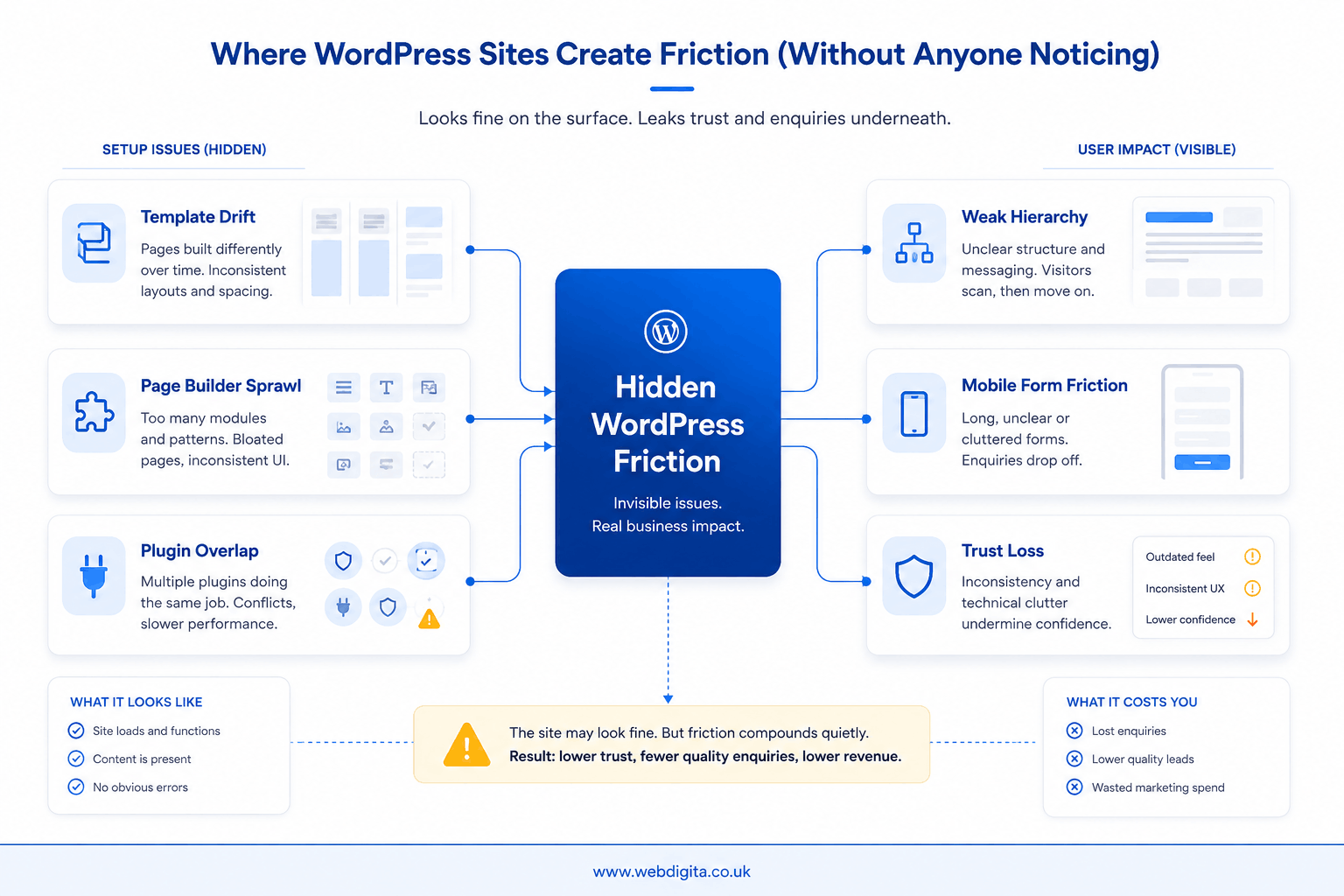
Plugin side effects matter too. Popups that interrupt reading, search tools that return weak results, forms that behave differently across pages, and cookie banners that crowd the screen can all damage flow. If you are seeing that kind of overlap, treat it as a UX issue first and a tooling issue second.
A common scenario: traffic lands on a service page, the offer seems relevant, but the page asks for contact too early, proof appears too late, and the mobile form feels effortful. The enquiry does not happen, or you get a weak-fit lead. That is why you should audit sequencing before approving a rebuild.
If the friction appears tied to legacy WordPress setup or outdated plugin conflicts then working with a professional WordPress Maintenance Agency on a maintenance retainer can do wonders for your website’s upkeep.

Not sure if WordPress friction is costing you enquiries
We can review the journey, templates, forms, proof placement, and mobile flow to show what is fixable now and what points to a bigger structural issue.
Clear diagnosis before redesign scope starts to drift
Red flags that block leads and trust first
Not every issue deserves equal attention. Prioritise the signals that interrupt confidence or reduce lead quality first – they are the ones most likely to distort your decision about whether the site needs a redesign at all.
Shahla’s experience auditing WordPress sites for trust and enquiry friction points to the same pattern consistently: most sites carry five to eight fixable UX blockers before any rebuild becomes necessary. That finding matters because it means most rebuild conversations are being opened before the simpler, higher-return work has been done.
- Navigation that makes users think: too many choices, vague labels, or no clear service path.
- Content hierarchy that buries the offer: weak headlines, cluttered modules, or proof appearing after the CTA.
- Trust signals in the wrong place: testimonials, accreditations, or team credibility shown too late.
- Forms that ask too much too soon: long fields, poor reassurance, or awkward mobile completion.
- Mobile flow that feels compressed: stacked banners, sticky elements, or poor tap spacing.
- Search that fails intent: especially on larger service or content-heavy sites where users need fast routes.
If you spot several of these together, do not treat them as isolated design annoyances. They usually combine into a bigger commercial problem: hesitation before contact.
You may also want to review the technical checks worth reviewing alongside a UX audit when page-builder bloat, mobile performance, and structure overlap.
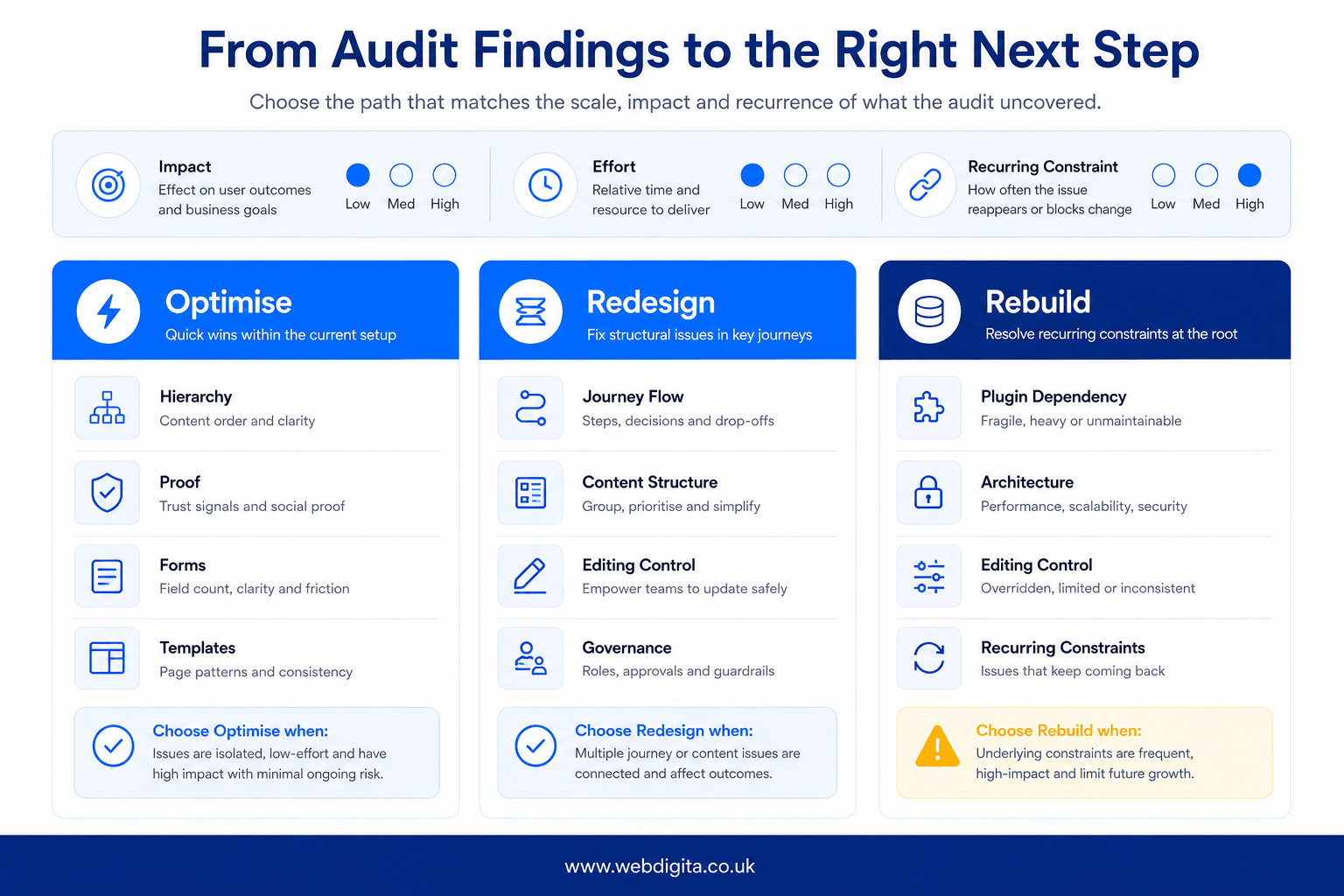
How to prioritise findings into quick fixes, redesign work, or a rebuild
The audit only becomes useful when it leads to a clear decision. Sort findings by impact on trust and lead flow first, then by effort, then by whether WordPress itself is creating recurring constraints. Do not start with the question, “Do we need a new site?” Start with, “What is making conversion harder than it should be?”
Quick fixes usually sit inside the current setup: clearer hierarchy, better proof placement, shorter forms, cleaner templates, and removal of conflicting plugin behaviour. Redesign work is justified when the structure is wrong across key journeys, even if the platform is still viable. A rebuild is the last step, and you should reserve it for cases where template logic, governance, plugin dependency, or technical debt make improvement inefficient.
When a rebuild is actually justified
The rebuild case becomes real when the WordPress setup itself is the repeating source of UX failure – not individual pages or isolated plugins, but the underlying architecture. Journey mapping at that point typically reveals the same drop-off patterns returning after each round of fixes, regardless of copy or layout changes.
Specific triggers worth testing before you scope a rebuild:
- Gutenberg block patterns or page-builder logic that cannot hold consistent information architecture across service pages – every editing session reintroduces the drift a previous fix cleared.
- ACF field structures that have outgrown the original content model, making it difficult for editors to maintain proof sequencing or CTA hierarchy without breaking page layouts.
- No design system governing templates – so typography, spacing, and trust block placement are controlled by individual page edits rather than reusable, governed components.
- Persistent editorial breakdowns where even trained content owners cannot maintain the conversion UX standard the business needs without specialist intervention each time.
Before committing to a rebuild, test whether a governance fix, a template reset, or a plugin replacement resolves the core problem. If those changes keep failing because the underlying structure actively resists them, the rebuild argument is sound. If they hold, a rebuild is premature.
| Decision path | Best fit when | What you should do next |
|---|---|---|
| Optimise | The journey is sound but blocked by fixable friction | Prioritise high-impact UX changes inside the current site |
| Redesign | Key pages lack clarity, consistency, and conversion structure | Rework templates, hierarchy, and proof sequencing |
| Rebuild | Platform setup or governance keeps reintroducing the same problems | Scope architecture, ownership, and delivery before build |
If the audit does point towards a bigger project, it may also help to read how to evaluate the agency before moving from audit to rebuild.
Questions buyers ask about a WordPress UX audit
These are the practical questions that usually come up before a redesign, rebuild, or agency brief is approved.
1. What should a WordPress UX audit actually cover?
A WordPress UX audit should cover the full route from landing to enquiry. That includes navigation, content hierarchy, trust signals, proof placement, forms, search, template consistency, plugin behaviour, and the mobile journey. The aim is to find where users hesitate, lose confidence, or drop out before contacting you.
2. Can a WordPress UX audit show whether we need a redesign or just fixes?
Yes, a WordPress UX audit should help you separate fixable friction from deeper structural problems. If the journey is sound and the blockers are things like weak hierarchy, poor proof placement, or awkward forms, targeted fixes may be enough. If the same issues keep returning because of templates, governance, or platform setup, bigger work may be justified.
3. Why do WordPress sites often feel awkward even when nothing looks broken?
WordPress sites often feel awkward because the friction is subtle rather than dramatic. Template drift, page-builder sprawl, inconsistent modules, plugin side effects, and weak mobile sequencing can all make the experience feel less credible. Users may not notice one specific fault, but they still lose confidence and delay action.
4. What are the biggest UX red flags that hurt leads first?
The biggest UX red flags are usually the ones that interrupt trust before contact. Common examples include confusing navigation, weak headlines, proof appearing too late, forms that ask too much too soon, and mobile layouts that feel cramped or effortful. These issues often reduce both enquiry volume and lead quality.
5. When is a rebuild genuinely the right call?
A rebuild is the right call when the underlying setup keeps reintroducing the same problems. That usually means fragile templates, heavy builder dependence, poor editing control, plugin dependency, or a content model that no longer fits the business. If improvement inside the current setup becomes inefficient, rebuild planning starts to make sense.
6. How should teams prioritise findings from a WordPress UX audit?
Teams should prioritise findings by commercial impact first. Start with the issues most likely to weaken trust, reduce lead quality, or block conversion, then weigh effort and technical constraint. That approach stops low-value cosmetic fixes taking priority over changes that actually improve the path to enquiry.
Conclusion
If your WordPress site feels weaker commercially than it should, the smartest move is not to jump straight into redesign language. You need enough diagnosis to tell whether the problem sits in the journey, the structure, or the way the platform is being managed over time.
What matters: A good audit gives you a cleaner decision, not just a longer issue list. It should show which changes will improve trust and lead flow inside the current site, and which problems point to a deeper structural limit.
Next step: Before you approve scope, compare every proposed change against one practical question: does this remove friction efficiently, or are you paying for a rebuild because nobody properly tested the existing site first?
Need UX design support after the audit findings are clear
If your WordPress site needs more than quick fixes, our UX UI design service helps restructure journeys, improve trust sequencing, and turn audit findings into a clearer conversion path.
View UX UI serviceNot ready for that yet