Key Takeaways
High-ticket B2B lead generation depends on trust structure, proof placement, and qualification paths working together, not on louder CTAs or borrowed landing-page tactics.
- Judge your site by lead quality and sales readiness, not raw enquiry volume, because one poor-fit lead can waste more time than ten low-intent visits are worth.
- Trust must be built into the site structure so buyers can quickly answer what you do, who you do it for, and why your approach is dependable across every page.
- Qualification paths should match buyer intent, offering softer exploration routes alongside expert conversations rather than forcing the same hard CTA everywhere.
- Proof works when it helps a serious buyer judge risk and recognise fit, not when it sits isolated or celebrates outcomes without showing delivery context.
When a deal is worth £50k or more, the website’s job is not to generate volume. It is to build trust, qualify fit, and support the sales process before a buyer ever picks up the phone.
A high-ticket B2B website needs to get five things right for lead generation – clear service architecture, visible trust signals, proof that reduces perceived risk, qualification paths that filter for fit, and a clean handoff into sales. If those five elements are disconnected, you may still generate enquiries, but you will get poor-fit leads, slower sales conversations, and avoidable doubt before a buyer has spoken to anyone.
This guide is for B2B sales leaders, marketing leaders, and commercial teams reviewing website performance before a redesign, provider search, or lead-quality improvement project.
Why high-ticket B2B websites fail when they chase volume first
High-ticket B2B lead generation is not a numbers game in the usual sense. If your average deal value is significant, one wrong enquiry wastes more sales time than ten low-intent visits are worth. The measure that matters is lead quality, sales readiness, and commercial fit – not raw form-fill volume.
A cautious buyer at this level does not land, click once, and convert. They move across service pages, proof, team signals, delivery detail, and practical buying questions before deciding whether you feel credible. Visual hierarchy signals this before a word is read – consistent, calm, structured presentation reads as operational control. A site that feels cluttered or disconnected creates Brand Anxiety before the copy has a chance to reassure.
This is why firms evaluating agencies for complex delivery – B2B web design, for instance – often need the full site to tell a coherent story, not just a persuasive homepage.
The honest problem is that many sites borrow landing page logic and spread it across the whole website. That can lift response volume, but it frequently lowers fit. Be wary of any design approach that pushes every visitor toward the same CTA before the site has built enough confidence to earn that ask.
A common result: a buyer likes the headline but cannot quickly tell whether you handle their size of project, their workflow, or their level of commercial risk. They do not complain. They leave.
Trust has to be built into the structure, not added as decoration
Think of this the way an architect thinks about a building. The trust is not the fascia – it is in the load-bearing structure underneath. A serious buyer needs to answer three questions quickly: what you do, who you do it for, and why your approach is dependable. Those answers have to be visible across the whole site, not buried behind vague messaging or left to a single About page.
Service architecture matters: If your offer is complex, the structure has to simplify without flattening. Buyers should be able to move from top-level service understanding into scope, process, proof, and likely fit without getting lost. If that navigation path is unclear, treat it as a structural conversion design problem – not a copy tweak.
Proof needs placement, not just presence: Case studies, delivery signals, sector relevance, and practical content should appear where the buyer is actively evaluating risk. If proof sits on one isolated page, it cannot do much work. Review whether your case-study design explains the problem, the approach, and the delivery confidence clearly enough to support a sales conversation.
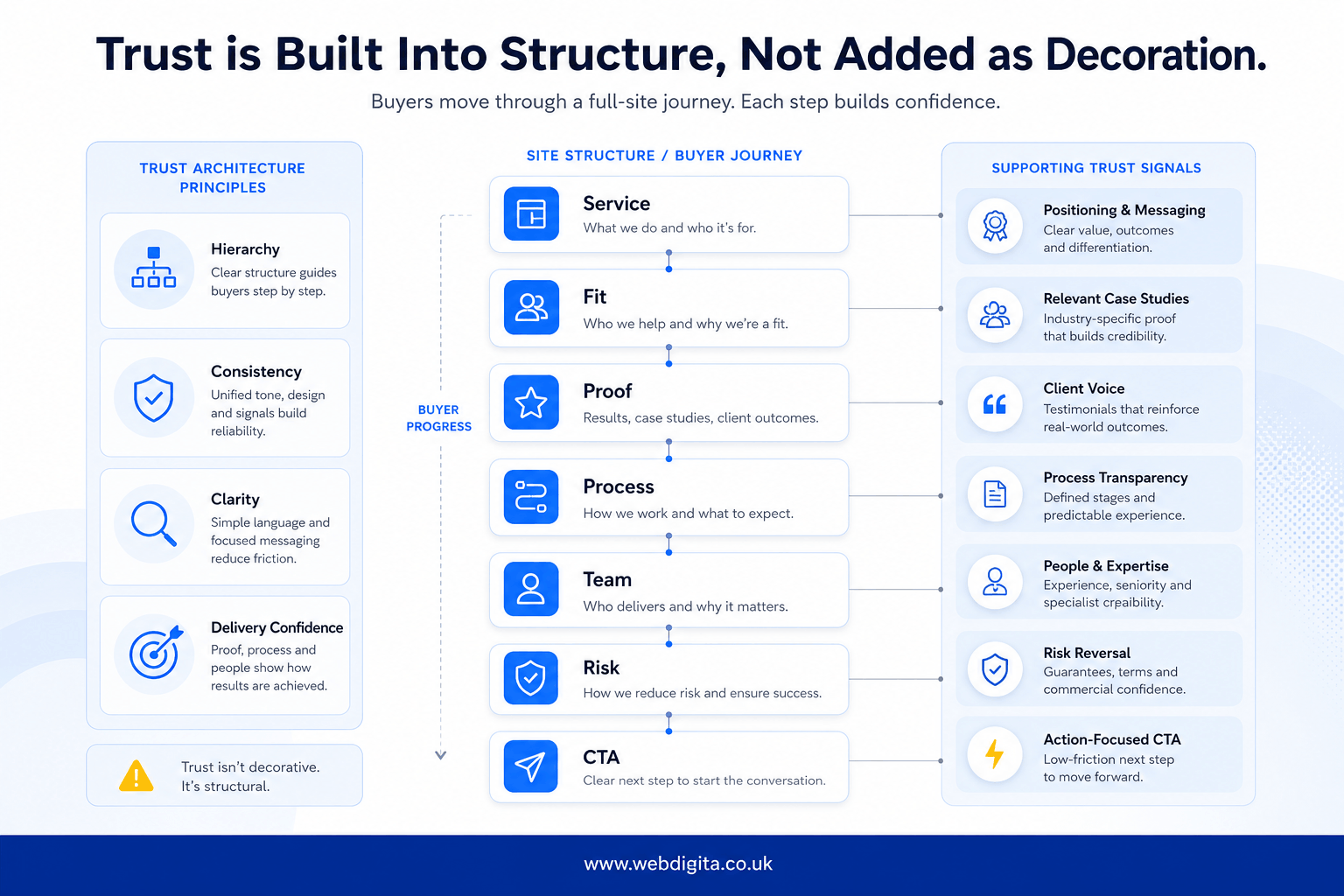
Visual trust matters more than most teams admit. Consistency, visual hierarchy, and calm presentation shape first impressions because buyers read design as a signal of operational control. If the site feels confused, capability feels confused too. If you want a deeper view of information architecture that supports buyer intent, that is often where the structural fix begins.
The pattern I see repeatedly: high-ticket firms win more qualified opportunities after structural trust and qualification improvements are made across the full site – not just isolated conversion pages. We call this the Full-Site Confidence approach. Ask whether your current site builds confidence page by page, or only asks for contact details at the end.
Qualification paths matter more than louder CTAs
If every page pushes the same hard conversion action, you are forcing readiness that does not exist yet. High-value buyers move at different speeds. Some want an expert conversation now. Others need more confidence around scope, quote workflows, delivery model, or implementation fit before they are ready.
Design your CTA hierarchy around buyer intent, not internal impatience. A primary route – speaking with an expert – can sit alongside softer paths: getting a strategic roadmap, reviewing relevant proof, or exploring service detail. If you want to understand what actually changes B2B lead quality on landing pages, the same principle applies: clarity and fit matter more than pressure.
Common qualification problems:
- Every page pushes the same demo or contact CTA regardless of buyer stage.
- Forms ask for too little context, so sales receives vague, thin enquiries.
- There is no path for buyers comparing scope, process, or implementation risk.
- Pricing context, quote logic, or next-step expectations are missing entirely.
Forms should help qualification, not just collection. You need enough context to route the lead properly and prepare sales – but not so much friction that the right buyer gives up. I would push on any provider that talks about conversion uplift without addressing qualification quality.

Is your website helping sales or creating more friction?
If enquiries feel vague or sales keeps re-asking basic questions, the problem is usually structural. We can review your current site against trust, qualification, and handoff logic to show you where the gaps are.
Quick diagnostic call, no obligation, just useful clarity.
A lead-generation website framework for high-value enquiries
Weak performance usually comes from broken links between trust, proof, qualification, CTA, and sales handoff. Review them as one system, because improving only one part rarely fixes the full journey.
WEBDIGITA Buyer Confidence Framework: use this to review whether your site is helping the right buyer move from first impression to a sales-ready enquiry.
- Trust: Clear service positioning, visible fit, confident visual hierarchy, and consistent UX presentation.
- Proof: Case studies, delivery evidence, sector relevance, and practical content placed near decision points.
- Qualification: Paths that help buyers self-select based on scope, readiness, and commercial fit.
- CTA: A sensible action ladder, from lower-friction exploration to expert conversation.
- CRM handoff: Form data, source context, and buyer intent passed cleanly into sales follow-up.
If one layer is weak, the next layer has to work harder. Strong proof cannot rescue a poor handoff. A well-designed CTA cannot compensate for weak trust. If you are planning a redesign or want to pressure-test assumptions before build, a project discovery workshop is often where those gaps become visible.
The red flags that quietly damage lead quality
Some websites look polished but still leave buyers uncertain. That is the dangerous version – the problem hides behind decent branding and tidy layouts. Check for the quieter faults that reduce confidence without showing up as obvious breakage.
- Service pages describe outcomes but not scope, fit, or delivery reality.
- Proof is vague, generic, or disconnected from the service being evaluated.
- One-size-fits-all CTAs ignore different buyer stages.
- Forms gather little useful context, so CRM records are thin and sales starts cold.
- Content looks refined but does not answer practical buying questions.
Watch for the gap between visual polish and buying clarity. A well-dressed site that fails to communicate scope or delivery model creates a specific kind of Brand Anxiety – the buyer cannot tell whether you handle their complexity, so they hesitate. If sales has to re-ask basic questions because the form and CRM handoff are weak, the website is not genuinely supporting pipeline.
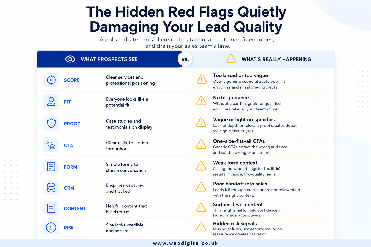
In project work, this often surfaces when marketing sees healthy enquiry numbers but sales keeps saying the leads are vague, early, or mismatched. That gap between what the site sends and what sales can use is a design and structure problem – not a traffic problem.
What proof and content depth should actually do
Proof is not there to impress. It is there to help a serious buyer judge risk – the same way structural drawings help a client trust a building before a single wall goes up.
Case studies should carry decision weight: Show the type of problem, the context, and the nature of the solution clearly enough that a buyer can recognise fit. If the case study only celebrates the outcome, it looks good but leaves practical doubts untouched. The strongest case studies are the ones a buyer could quietly share internally to make the case for shortlisting you.
Sales-assist content should answer the next question before it is asked: Service pages, FAQs, process pages, and supporting resources should reduce friction before the first call. Content depth matters most where buyers hesitate – around implementation, ownership, timelines, page speed guarantees, and what working together actually looks like day to day.
My view, having worked through dozens of high-ticket B2B site reviews, is that the redesign conversations that go wrong are almost always the ones that focus on homepage messaging while leaving the deeper service, proof, and process pages thin. That is where buyer confidence either forms or falls apart.
High-ticket buyers rarely convert because a site feels exciting. They convert because the site makes the next step feel lower risk.
What to check before you choose a web design partner
If you are evaluating a provider, do not stop at visual quality or portfolio style. You need to know whether they think in full-site lead flow, buyer confidence, and sales support. Ask how they handle service architecture, proof placement, qualification paths, and CRM alignment as a connected system – not as separate deliverables.
You should also ask who owns the messy parts after launch: content updates, form logic, tracking, proof refresh, and ongoing improvement. If post-launch responsibility is vague, long-tail cost usually follows.
The right next step is rarely a bigger wishlist. It is a sharper conversation about trust, qualification, and handoff. If you want to speak with a web design expert, bring your current site, your sales friction points, and the kinds of enquiries you actually want more of. That is where a useful review starts.
Questions buyers ask before choosing a high-ticket B2B website partner
Common concerns around lead quality, site structure, and what actually drives better enquiries in complex B2B sales.
1. What makes a high-ticket B2B website different from a standard business site?
A high-ticket B2B website prioritises lead quality and sales readiness over raw enquiry volume. It needs clear service structure, visible trust signals, proof that reduces risk, qualification paths that filter for fit, and a clean handoff into sales. The site must help serious buyers judge complexity, scope, and delivery confidence before they contact you, because one wrong enquiry can waste more sales time than ten low-intent visits are worth.
2. How do you improve lead quality without reducing enquiry volume too much?
You improve lead quality by building qualification into the site structure rather than pushing every visitor towards the same hard CTA. Offer softer paths like exploring relevant proof, reviewing service detail, or understanding scope alongside expert conversation routes. Use forms that gather enough context to help sales prepare properly. The goal is to filter for fit early so the enquiries you receive are sales-ready, not just curious.
3. Where should proof and case studies appear on a high-ticket B2B site?
Proof should appear where buyers are evaluating risk, not just on one isolated case-study page. Place relevant case studies, delivery signals, and sector evidence near service pages, process explanations, and decision points. Each case study should explain the problem, approach, and delivery confidence clearly enough that a buyer can recognise fit. If proof sits hidden or only celebrates outcomes, it cannot do much work.
4. What are the most common structural problems that damage B2B lead quality?
Common problems include service pages that describe outcomes but not scope or fit, vague or generic proof disconnected from the service being evaluated, one-size-fits-all CTAs that ignore buyer stage, and forms that gather too little context for sales to start confidently. Another frequent issue is content that looks polished but does not answer practical buying questions around implementation, ownership, timelines, or what working together actually involves.
5. How should qualification paths work on a high-ticket B2B website?
Qualification paths should match buyer intent and readiness. Some buyers want an expert conversation immediately, while others need more confidence around scope, delivery model, or implementation fit first. Design a CTA hierarchy that offers primary routes like speaking with an expert alongside softer paths like getting a roadmap, reviewing proof, or exploring service detail. Forms should help qualification by gathering enough context to route leads properly without creating unnecessary friction.
6. What should you ask a web design partner before committing to a high-ticket B2B project?
Ask how they handle service structure, proof placement, qualification paths, and CRM alignment together, not as separate add-ons. Find out whether they think in full-site lead flow and buyer confidence, or just visual quality. Clarify who owns content updates, form logic, tracking, proof refresh, and ongoing improvement after launch. If post-launch responsibility is vague, long-tail cost usually follows.
7. How do you know if your current site is creating poor-fit leads?
If marketing sees healthy enquiry numbers but sales keeps saying the leads are vague, early, or mismatched, treat that as a design and structure issue. Other signs include buyers who cannot quickly tell whether you handle their size of project or complexity, forms that pass thin CRM records into sales, and proof that looks good but does not help buyers judge risk or recognise fit.
8. What role does content depth play in high-ticket B2B lead generation?
Content depth should answer the next question a serious buyer has, especially around implementation, ownership, timelines, and what working together actually looks like. Service pages, FAQs, process pages, and supporting resources should reduce friction before the first call. You need content depth where buyers hesitate, not just on the homepage. If deeper pages are thin, the site is not really supporting pipeline.
Conclusion
The gap between a polished website and one that actually generates high-quality leads usually comes down to structure, not surface. If your site looks credible but sales keeps receiving vague or mismatched enquiries, the problem is likely in how trust, proof, qualification, and handoff connect across the full buyer journey.
- Review whether service pages explain scope and fit clearly enough for a buyer to self-select before they contact you.
- Check if proof appears where buyers are evaluating risk, not just on one isolated case-study page.
- Audit your CTA hierarchy to see if you are offering paths that match different buyer stages rather than forcing one action everywhere.
- Look at your form-to-CRM handoff to confirm sales receives enough context to start conversations confidently.
If your website needs to support high-value sales, not just generate volume
We design B2B websites that build trust, qualify fit, and hand clean context into your CRM. Service structure, proof placement, qualification paths, and sales handoff are treated as one system, not separate add-ons.
Explore web design servicesOr if you prefer,