Key Takeaways
- Message match matters more than form length: If the page promise does not match the campaign intent, you will attract curiosity instead of buying intent, even if conversion rate looks strong.
- Proof should sit where doubt appears: Place trust signals beside the moment of hesitation rather than stacking logos at the footer, and make sure the proof supports the specific claim being made.
- Form logic should screen for intent: Use helpful friction such as role, project stage, or budget range to filter weak interest, and match CTA language to the buyer's actual readiness rather than pushing for a meeting too early.
- Rebuild when the structure is wrong: If the page cannot tell the right buyer from the wrong one, or if the offer is too broad to qualify intent, cosmetic changes will not fix lead quality.
Stop designing for conversions. Start designing for sales-qualified leads. There is a big difference – and most B2B landing pages are still on the wrong side of it.
The short answer: The design changes that genuinely improve B2B lead quality are structural, not cosmetic. Tighter offer-message match, proof placed at the exact moment of doubt, form logic that screens for intent, and CTA language calibrated to buyer readiness will do more for your SQL rate than any colour test or headline tweak. If a landing page looks efficient but fills your pipeline with poor-fit submissions, the page’s visual hierarchy and trust architecture are working against you – not for you.
This guide is for B2B marketers, demand gen teams, and commercial leads reviewing paid or outbound landing pages before a redesign, optimisation pass, or agency evaluation.
What changes lead quality first: message match and visual intent
The first shift is almost never the form. It is whether the page’s visual hierarchy clearly reflects the promise that brought the visitor there.
Think of it like a building entrance. If the lobby does not match the prestige of the address on the invitation, trust erodes before a single word is read. The same principle applies here. If your ad, email, or outbound message signals a specific outcome, the landing page must echo that same intent through its headline, subhead, and CTA – in that sequence, at that weight.
Check whether the page communicates who it is for, what problem it solves, and what happens next. If those signals are vague or buried, you attract curiosity rather than buying intent.
A common pattern I see: paid traffic lands on a page promising a specific workflow solution, but the headline reads like a brand tagline. The page may still convert, but it invites people browsing loosely – people who were never going to become the conversation you wanted.
- Headline could apply to almost any buyer in any sector
- CTA asks for a meeting before the page has established trust
- No visible signal of fit, budget context, or use case
- Offer reads as educational when sales expects commercial intent
Broad visual positioning is a qualification problem, not a copy preference. The design has to do the screening that the sales team should not have to do manually. If you want a wider lens on how visual structure shapes response quality, these conversion-centred web design principles are worth reviewing alongside this.
Where proof and trust cues should sit on a B2B landing page
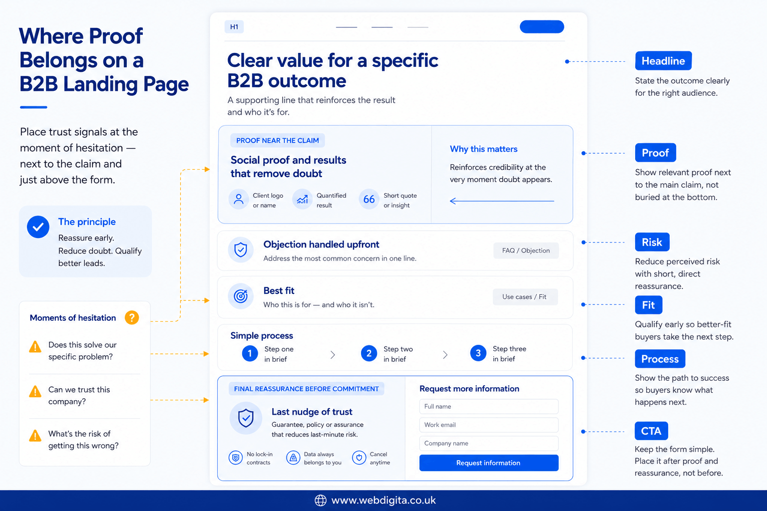
Proof helps lead quality when it sits beside the exact moment where hesitation forms. Most pages get this wrong by stacking logos near the footer or placing testimonials that do not support the specific claim being made.
Think of it as load-bearing design – not decoration on the walls, but structural support at the points where the page’s argument could otherwise collapse. If the page claims specialist capability, evidence of that capability should appear there, in that section, at that visual weight.
If the form asks for a call, the block immediately above it should reduce anxiety: what happens next, who they will speak with, what kind of company you usually help. Watch for proof that looks polished but says nothing about fit.
What matters most: relevance, placement, and risk reduction. A logo strip can help establish category credibility, but it is weaker than proof that shows you understand the buyer’s specific context, challenge, or commercial stakes. I would push on any page where the trust cues compete visually with the main message instead of reinforcing it.
The pattern I have seen most consistently across high-performing B2B pages is this: landing-page structure changes improved SQL rate and reduced poor-fit enquiries when intent and trust were made clearer upfront – not by adding more proof, but by placing the right proof at the right point in the visual sequence. That is the Webdigita SQL Proof Sequence principle: proof earns its position by reducing the specific doubt that exists at that exact moment in the page’s flow.
If you are dealing with high-ticket or high-consideration enquiries, the trust signals high-ticket buyers look for before enquiring are worth reviewing alongside proof placement.
Landing-page anatomy for stronger SQLs
A stronger page is not one with more sections. It is one where the sequence feels deliberate – where each block answers the next buyer question before that question becomes hesitation.
I think of this like a well-designed reception space. Every element exists to guide the visitor from arrival to confidence, at the right pace. If you skip a stage, the visitor fills the gap themselves – usually with doubt.
Review the page as a flow, not as separate design components. Ask whether the hierarchy moves the visitor from relevance to confidence to action, or whether it jumps straight to capture.
The Webdigita SQL Landing Page Framework
Use this to check whether your page is guiding the right visitor towards the right next step, rather than collecting interest too early.
- Headline: state the offer and intended buyer clearly – who this is for and what it solves
- Subhead: name the problem solved and the most likely use case
- Early proof: place relevant credibility close to the main claim, not at the bottom
- Objection handling: answer the obvious risk, effort, or fit concern before the visitor voices it
- Form logic: ask only for fields that help qualify intent – role, context, timing
- Qualification friction: enough effort to filter weak interest, not so much that genuine buyers abandon
- CTA framing: describe the next step honestly – what it costs in time, what the buyer gets back
If your current page skips two or three of those stages, cosmetic edits will not fix lead quality. That is often where working with a specialist web design agency becomes useful – because the real issue is page logic and visual hierarchy, not button colour.

Not sure if your landing page is filtering for quality or just collecting volume?
We can review your current page structure, form logic, and trust placement to identify whether you need cosmetic improvements or a deeper rebuild. The diagnostic is quick, practical, and focused on SQL quality rather than surface metrics.
No obligation. Just a clear view of what is working and what needs fixing.
How form logic and qualification friction improve lead quality
The best B2B forms do not simply remove friction. They use the right friction at the right moment.
You need to decide what the form is actually for. If the goal is sales-ready conversations, the form should help screen for role, need, timing, or account context. If the goal is softer, early-stage interest, the CTA and fields should reflect that. Do not assume a shorter form is always better – easier submission often means weaker intent.
I see this pattern most often on pages where the CTA promises a strategic conversation but the form asks for almost nothing. Sales then has to do qualification work that the page design should have started.
- Helpful friction: role field, project stage, budget range, company context, realistic CTA such as “request a review”
- Harmful friction: long admin-heavy forms, unclear field purpose, hard-sales CTA language, irrelevant data capture, forced commitment before the visitor is ready
Check whether your CTA language matches the buyer’s actual stage. “Speak to sales” can feel premature for a MOFU visitor still evaluating options. “Request a tailored review” or “Talk through your page” signals a lower-risk next step while still attracting serious intent.
If you are seeing drop-off and weak-fit leads simultaneously, review the common friction points on lead-gen websites before changing the form.
Improve the page or rebuild it: an honest diagnostic
Not every underperforming page needs to be torn down. But some do – and treating a structural problem as a styling problem is one of the most common mistakes I see in B2B design briefs.
A useful analogy: if a building’s floorplan is wrong, repainting the walls will not fix the flow. The same is true here. Surface-level optimisation works when the underlying architecture is sound. When it is not, you are polishing something that will keep underperforming regardless of how refined the details become.
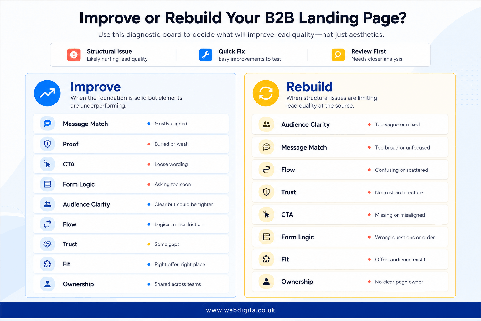
Improve the page when the offer is clear, the audience is well-defined, but proof is buried, CTA wording is off, objections are unanswered, or the form asks for too little. The visual trust architecture is present – it just needs refinement.
Rebuild the page when the message is too broad to attract the right buyer, the visual hierarchy has no clear sequence, the page cannot distinguish the right visitor from the wrong one, or there is no trust architecture at all. Incremental changes will not solve a foundation issue.
Before briefing a designer or agency, ask these five questions:
- Does the page clearly state who the offer is for – and signal who it is not for?
- Is the proof directly tied to the main claim, or just added for surface reassurance?
- Does the CTA match buyer readiness, or does it push too hard too soon?
- Does the form help qualify intent, or simply collect contact details?
- Would a sales team recognise this page as attracting the right kind of conversation?
If two or more of those answers are no, treat it as a structural issue – not a copywriting one.
If you want a second opinion before making that call, speak with a web design expert who can assess the page for fit, visual trust, and qualification logic – rather than chasing a higher raw conversion rate in isolation.
Questions teams ask before redesigning B2B landing pages
Common concerns about improving lead quality without reducing conversion volume.
1. How do you improve lead quality without reducing conversion rate?
You improve lead quality by adding helpful qualification friction rather than removing all friction. Use form fields that screen for role, project stage, or budget context, and make sure the CTA language matches buyer readiness. A page that converts slightly fewer visitors but attracts better-fit leads usually delivers stronger pipeline contribution and shorter sales cycles.
2. What is the difference between helpful friction and harmful friction on a landing page?
Helpful friction screens for intent without creating confusion. Examples include asking for role, company size, project stage, or budget range. Harmful friction includes long admin-heavy forms, unclear field purposes, or CTAs that push too hard too soon. The goal is to filter weak interest while making the process feel fair and relevant to serious buyers.
3. Where should proof and trust signals appear on a B2B landing page?
Proof should sit where hesitation begins, not just at the footer. If the page claims specialist capability, show relevant evidence beside that claim. If the form asks for a call, reduce anxiety just above it with signals about process, expected next step, or the kind of company you usually help. Proof works best when it reinforces the main message rather than competing with it.
4. Should a B2B landing page use a short form or a long form?
It depends on the goal. If you want sales-ready conversations, the form should help qualify intent by asking for role, need, timing, or account context. If the goal is softer interest, the form should reflect that. A shorter form is not always better, because easier submission often means weaker intent and more unqualified leads for sales to filter.
5. How do you know if a landing page needs improvement or a full rebuild?
Improve the page if the offer is sound and the audience is clear, but proof is buried, CTA wording is off, or the form is too loose. Rebuild the page if the message is broad, the flow is confused, the page cannot tell the right buyer from the wrong one, or there is no visible trust architecture. If two or more structural issues exist, treat it as a rebuild rather than an optimisation pass.
6. What does message match mean on a B2B landing page?
Message match means the landing page clearly repeats the promise that brought the visitor there. If your ad, email, or outbound message offers a specific outcome, the page should state the same intent in the headline, subhead, and CTA. When message match is weak, you attract curiosity instead of buying intent, even if the page converts well.
7. How should CTA language change for different buyer stages?
CTA language should match buyer readiness. Early-stage buyers respond better to lower-risk CTAs such as 'request a review' or 'talk through your page' rather than 'speak to sales' or 'book a demo'. If the page has not yet earned trust or answered objections, a hard-sales CTA can feel premature and reduce both conversion rate and lead quality.
8. What form fields help qualify B2B landing page leads?
Fields that help qualify intent include role, company size, project stage, budget range, and use case. These fields let you screen for fit without creating unnecessary admin burden. Avoid asking for irrelevant data or forcing commitment too early. The goal is to give sales enough context to prioritise the conversation without making the form feel invasive.
Conclusion
A landing page that converts well but attracts the wrong leads is not a conversion problem. It is a qualification problem. The page is doing its job, but the job was defined too loosely.
The best B2B landing pages do not just capture interest. They screen for fit, signal credibility at the right moment, and set honest expectations about what happens next.
If you are seeing high form fills but weak pipeline contribution, start by checking whether the page clearly states who it is for, whether the proof supports the main claim, and whether the CTA matches buyer readiness. Those changes usually improve SQL quality faster than redesigning the form or testing button colours.
If your landing pages are converting but sales is still chasing weak-fit leads, the structure may need rethinking
We design B2B landing pages that improve lead quality by making intent, fit, and next-step expectations clearer before the form. That means tighter message match, proof placed where doubt appears, and form logic that screens for buying stage rather than just collecting contact details.
Review our web design approachOr if you prefer,