Key Takeaways
Conversion-centred design changes how a page builds confidence, not just how it looks. The difference is in hierarchy, message order, proof placement, and how much effort a buyer needs before feeling safe enough to act.
Decision friction is structural: It shows up as unclear relevance, buried proof, equal-weight sections, and CTAs that ask too much too soon. Cosmetic redesign rarely fixes this because the brief focused on layouts rather than decision flow.
Scope controls cost and outcome: Content ownership, SEO inclusion, CMS choice, mobile-first discipline, and revision boundaries all affect budget and performance. A stronger brief defines page purpose, proof order, and dependencies before design starts.
A website can look credible, feel on-brand, and still leak leads every week. Most marketing directors I speak to know something is off – the site looks the part, the design agency delivered what was briefed, and yet the enquiries are not there. That unease is not irrational. It is a signal that the site is doing one job well and quietly failing at another.
Think of it like a beautifully fitted suit that is cut for the wrong occasion. It is impeccably made. It just does not communicate the right thing to the right person at the right moment. That gap – between how a site looks and how it makes a buyer feel about trusting you – is where most lead loss happens.
Conversion-centred design closes that gap. It changes the order in which a page builds confidence – hierarchy, message sequence, proof placement, CTA timing, friction points, and trust signals – so that by the time a buyer reaches the ask, the answer feels obvious rather than risky. Most agencies leave that work out because the brief asks for layouts, components, and delivery. That is why polished redesigns still underperform.
This guide is for marketing directors, commercial leads, and founders reviewing an underperforming site, shaping a redesign brief, or shortlisting agencies. If you already work with a web design agency, it will help you sharpen what you ask of them.
What conversion-centred design actually changes on the page
The clearest way to see it: a design-led page presents information. A conversion-led page builds confidence in the right order. A buyer arrives with three unspoken questions – is this relevant to me, can I trust this, and what should I do next? The order in which you answer them is everything.
The weak version is familiar: a broad headline, a generic claim, a hero image, and a prominent contact button. It looks composed. But it asks for trust before it has earned it, which is the visual equivalent of a handshake and an invoice in the same breath.
The short answer: conversion-centred web design best practices change hierarchy, proof timing, and message order so buyers feel confident enough to act – not just informed enough to scroll. Most agencies skip this because it requires scoping the decision journey before a single component is designed.
The stronger version leads with a specific promise, signals who it is for, places proof close to the claim, removes unnecessary choices, and only then extends an invitation to act. That sequencing is not decoration. It is the architecture of trust.
If you are reviewing agency work, do not assume a cleaner layout means better conversion logic. And if your site includes service pages, landing pages, or even eCommerce website development, the question to ask of each page is whether it reduces hesitation or simply presents content more neatly.
The anatomy of a conversion-centred page
Standard page: broad headline, early CTA, proof pushed down, sections with equal visual weight.
Conversion-led page: clear relevance at the top, proof near the main claim, benefits in buyer language, a visible next step, and lower-page detail for cautious buyers who still need reassurance.
What changes: hierarchy, proof timing, message order, and how much cognitive effort the buyer has to spend before feeling safe enough to act.
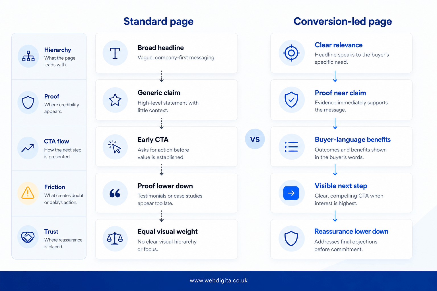
Think of conversion-centred web design best practices as page design with commercial purpose. The page should not just look coherent; it should make the buyer feel that acting is the natural next step, not a leap of faith.
Where most agencies miss the real issue
Most agencies are not ignoring conversion on purpose. They are responding to the brief they were given. And most briefs ask for pages, styles, and content blocks – and say almost nothing about decision flow, proof order, or where trust needs to be earned before the ask.
That is how you end up with a site that photographs beautifully in a case study and quietly underperforms in practice. Weak hierarchy, vague messaging, buried proof, CTAs that appear before doubt has been addressed. That is not a copy problem. It is structural – a confidence sequence that was never designed.
In my experience reviewing redesign briefs and post-launch performance across B2B service sites, the pattern holds: the gains almost never come from visual polish. They come from clearer hierarchy, stronger messaging, better proof sequencing, and reduced decision friction. The implication for any brief is significant: the most refined-looking redesign can still underperform if those four things were never scoped. The brief – not the agency’s aesthetic judgement – is often where the commercial outcome is determined.
If you are trying to diagnose whether this is your problem, a UX friction audit for lead-gen websites can help surface what the visuals are hiding.
The warning signs tend to be structural, not aesthetic:
- Your headline sounds polished but does not say who you help or why you are different.
- Testimonials or proof sit too low to support the first claim a buyer sees.
- Every section carries similar visual weight, so nothing feels clearly important.
- The CTA appears early, but the page has not addressed obvious doubts about fit or cost.
- Forms ask for commitment before the buyer understands whether you are the right match.
If those signs appear in your current site or in agency mock-ups, the brief has almost certainly missed the real job.
How decision friction quietly costs you leads and budget
Decision friction is what happens when a buyer cannot quickly judge relevance, trust the claim, or understand what to do next. It rarely looks dramatic. It is more like a subtle wrongness – the feeling a room is almost right but something about the proportions is off. The buyer cannot name it. They just leave.
On B2B sites, this shows up as too many equal-priority messages, generic CTAs, unclear service fit, or forms that appear before reassurance. The cost is not only lost enquiries – it also produces weaker leads, slower internal decisions, and more post-launch fixes.
Cosmetic redesign is often the expensive detour.
A pattern I see often: a marketing director approves a redesign because the current site feels dated, only to find the new version still underperforms because conversion logic was never scoped. That typically means extra revision rounds, delayed sign-off, and a second phase to address messaging, proof, and page flow that should have been resolved before design started. It is usually the moment finance begins asking why the lowest proposal became the most expensive project.
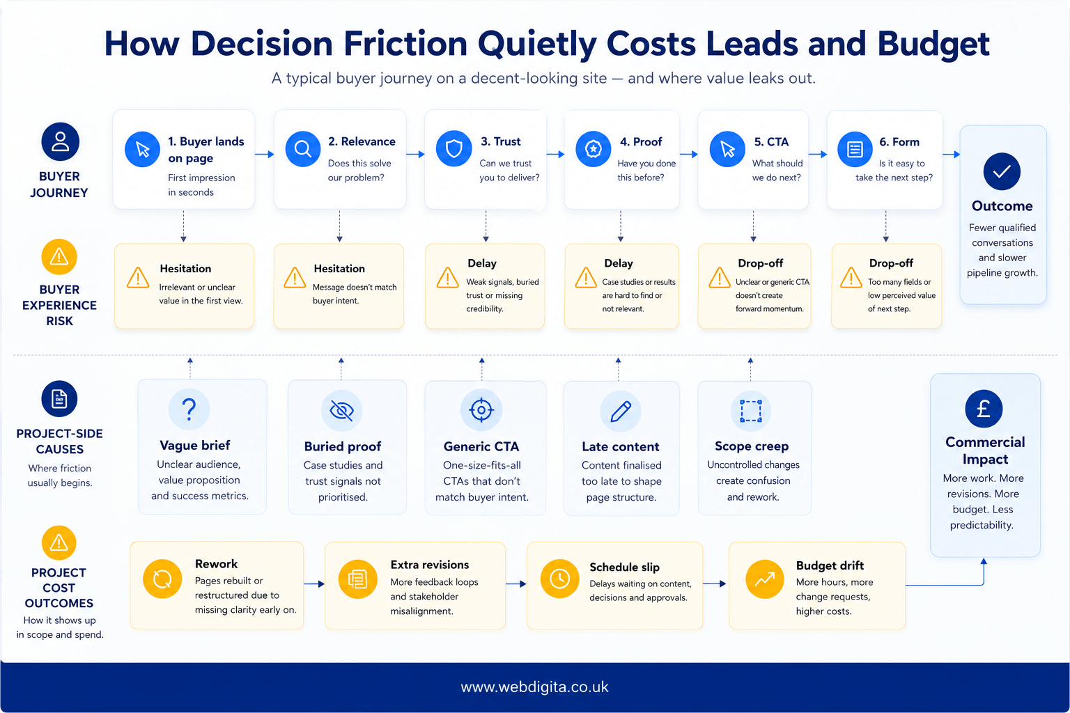
Scope is what controls that risk. Custom design versus template-led builds, CMS choice, page count, integrations, content production, SEO setup, and post-launch support all affect budget. In the UK, those choices are often what move a project from a simpler brochure-style build into the lower five-figure range for a considered redesign.
Content ownership matters. If the agency is waiting on your team for copy, approvals, or proof assets, timelines slip and design rounds get spent on placeholder assumptions rather than real decisions.
SEO is often excluded. Ask whether technical setup, redirects, metadata, page structure, and crawl basics are in scope or treated as additional work after launch.
Mobile-first has a cost logic. It requires more decisions earlier – content priorities, hierarchy choices, navigation structure – but that discipline usually reduces compromise and rework later compared to retrofitting a desktop design for mobile.
If you are weighing that trade-off, it helps to review whether bespoke or template-led design is the better fit.

Does your site look credible but still leak leads every week?
We help marketing directors and commercial leads diagnose where conversion logic breaks down before design starts. A short diagnostic call can show whether the issue is hierarchy, proof placement, message order, or something deeper in the brief.
No pitch. Just a clear view of what needs fixing first.
What to ask before you hire a conversion-centred design agency
If an agency talks mainly about style, inspiration, and page count, that is not necessarily a problem – visual sensibility matters. But push further. The questions that reveal whether a conversion-centred design agency understands its real job are not about aesthetics. They are about the confidence architecture underneath the visuals.
My view, having reviewed agency proposals and post-launch performance for a range of B2B service sites, is that most scope problems are brief problems. Revision rounds, missing content, unclear integrations, and late stakeholder input nearly always increase cost because they create loops that were avoidable with a cleaner starting point. A stronger brief is not a bureaucratic exercise. It is the kindest thing you can do for the project.
Use this as a conversion-centred design agency checklist when evaluating proposals or shaping a brief:
- What is each key page meant to make the buyer feel and believe before they act?
- Where will proof appear in relation to the main claims, and who decides its placement?
- Who owns content creation, and what happens to the timeline if content arrives late?
- Is SEO setup included – and specifically, what does that cover as a minimum?
- How do CMS choice, integrations, and mobile-first decisions affect cost and flexibility over time?
- How many revision rounds are included, and what counts as an out-of-scope change?
If the brief still feels uncertain after those conversations, a project discovery workshop or a structured scoping step before design starts is usually the most reassuring way forward. It defines page goals, proof dependencies, content ownership, and scope boundaries before budget is committed on assumptions.
What a stronger brief looks like when conversion matters
A stronger brief does not start with page count alone. It starts with page purpose: what each page needs the buyer to feel, what proof makes that feeling credible, who is supplying the content, what SEO and technical setup is included, and how the site is cared for after launch.
A simple brief check
Before visual design begins, every key page should have a clear answer to three questions: what is this page for commercially, what proof makes that promise believable, and who owns the content that carries it? If those questions do not have answers before the brief goes out, the design process will answer them for you – usually through revision rounds, rework, and budget that was not planned for.
If the site needs ongoing updates, fixes, monitoring, or platform care after launch, check what is covered and at what point support becomes out of scope. For stores and more complex builds, planning a eCommerce maintenance and support retainer early can prevent the usual handover gap.
Conversion-centred design is a confidence system, not a cosmetic layer. A well-designed site should feel the way a trusted advisor’s office feels – credible, calm, and oriented entirely around making you feel comfortable with the next step. If you want to pressure-test an existing site or a redesign brief before budget gets committed, speaking with a web design expert is the fastest way to understand whether the issue is appearance, structure, or both.
Related reading: what a bespoke web design project actually costs.
Questions buyers ask before redesigning for conversion
Common concerns about conversion-centred design, scope, and agency selection
1. What is conversion-centred web design?
Conversion-centred web design is page design with commercial purpose. It changes hierarchy, message order, proof placement, and CTA flow so the buyer gets the right reassurance before being asked to act. The focus is on building confidence in the right sequence rather than simply presenting information more neatly.
2. How is conversion-centred design different from standard web design?
Standard design presents information and asks for action early. Conversion-centred design builds confidence first by leading with clear relevance, placing proof near the main claim, using buyer language for benefits, and only then asking for the next step. The difference is in decision flow, not just visual polish.
3. Why do polished redesigns still underperform?
Most briefs focus on layouts, components, and page delivery rather than decision flow, proof order, or trust sequencing. That creates sites that look credible but still leak leads because they ask for action before earning enough buyer confidence. The problem is structural, not cosmetic.
4. What is decision friction on a website?
Decision friction is what happens when a buyer cannot quickly judge relevance, trust the claim, or understand the next step. It shows up as unclear messaging, buried proof, equal-priority sections, generic CTAs, or forms that appear before reassurance. It slows intent until buyers hesitate or leave.
5. What should I ask an agency before hiring them for conversion-centred design?
Ask how they decide what appears first on the page, what proof supports each claim, and how they reduce hesitation before the CTA. Also clarify content ownership, SEO scope, revision limits, CMS choice, and what happens if content or approvals arrive late. Those questions reveal whether they understand decision flow or just page delivery.
6. Does conversion-centred design cost more than standard web design?
Not necessarily. The cost depends on scope, not conversion focus. Custom design, CMS choice, page count, integrations, content production, SEO setup, and support all affect budget. Conversion-centred work often reduces revision rounds and post-launch fixes because the brief defines page purpose and proof order earlier.
7. How do I know if my current site has decision friction?
Check whether your headline says who you help and why you are different, whether proof sits close to the main claim, whether every section has similar visual weight, and whether CTAs appear before obvious doubts are answered. If those signs show up, the issue is usually structural rather than visual.
8. Should I use a discovery workshop before redesigning for conversion?
Yes, especially if the brief feels unclear or if stakeholders disagree on page goals, proof needs, or content ownership. A discovery workshop defines page purpose, trust signals, dependencies, and scope boundaries before design starts. It usually prevents expensive revision loops and post-launch fixes.
Conclusion
Conversion-centred design is a confidence system, not a cosmetic layer. If your site looks credible but still underperforms, the issue is usually structural rather than visual.
- Check whether each page builds trust in the right order before asking for action
- Clarify content ownership, SEO scope, and revision boundaries before design begins
- Push agencies to explain how they decide proof placement, hierarchy, and CTA timing
- Use a discovery workshop or friction audit to define page goals and dependencies early
Ready to build a site that earns trust before it asks for action?
WEBDIGITA designs conversion-centred websites that reduce hesitation, place proof where it matters, and guide buyers through the decision without friction. We work with marketing directors and commercial leads who need a site that performs, not just presents.
See our web design serviceOr if you prefer,